

Building a report
Give Autopilot an example presentation and have it build a report from your data
Introduction
Now, you'll turn the tutorial data into something you can share: a polished, presentation-style report. You won't design a single slide — you'll hand Autopilot the example PowerPoint you downloaded at the start, and it will rebuild a full presentation object within your workflow wired up to your data pipeline so it the report can easily be refreshed in the future.
This guide continues from Exploring data. Have the Sales Report.pptx sample file handy — it's the third download on the Overview page.
Ask for the report
- Click the paperclip icon in the message box and attach
Sales Report.pptx. - With the file attached, type:
Build a report like this presentation from my data
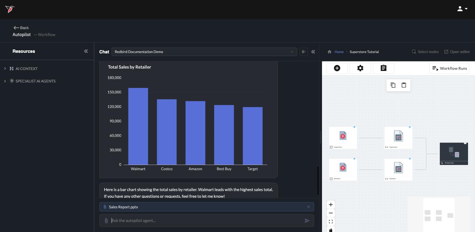
- Press Enter. Autopilot reads the example file and tells you what it found — the slides, charts, and the design it will reuse. It may ask a quick question or two before building, such as confirming it should use the datasets in your workflow. Answer in the chat (a simple "yes" works) and the build begins.
While the report builds
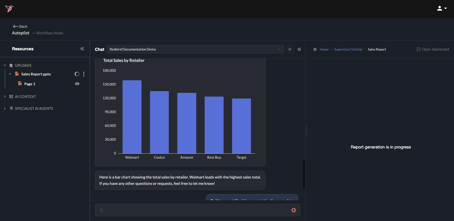
Building takes a few minutes. The preview panel on the right shows Report generation is in progress while Autopilot recreates each slide — matching the example's layout and style, but filling every chart and number from your prepared data.
See the result
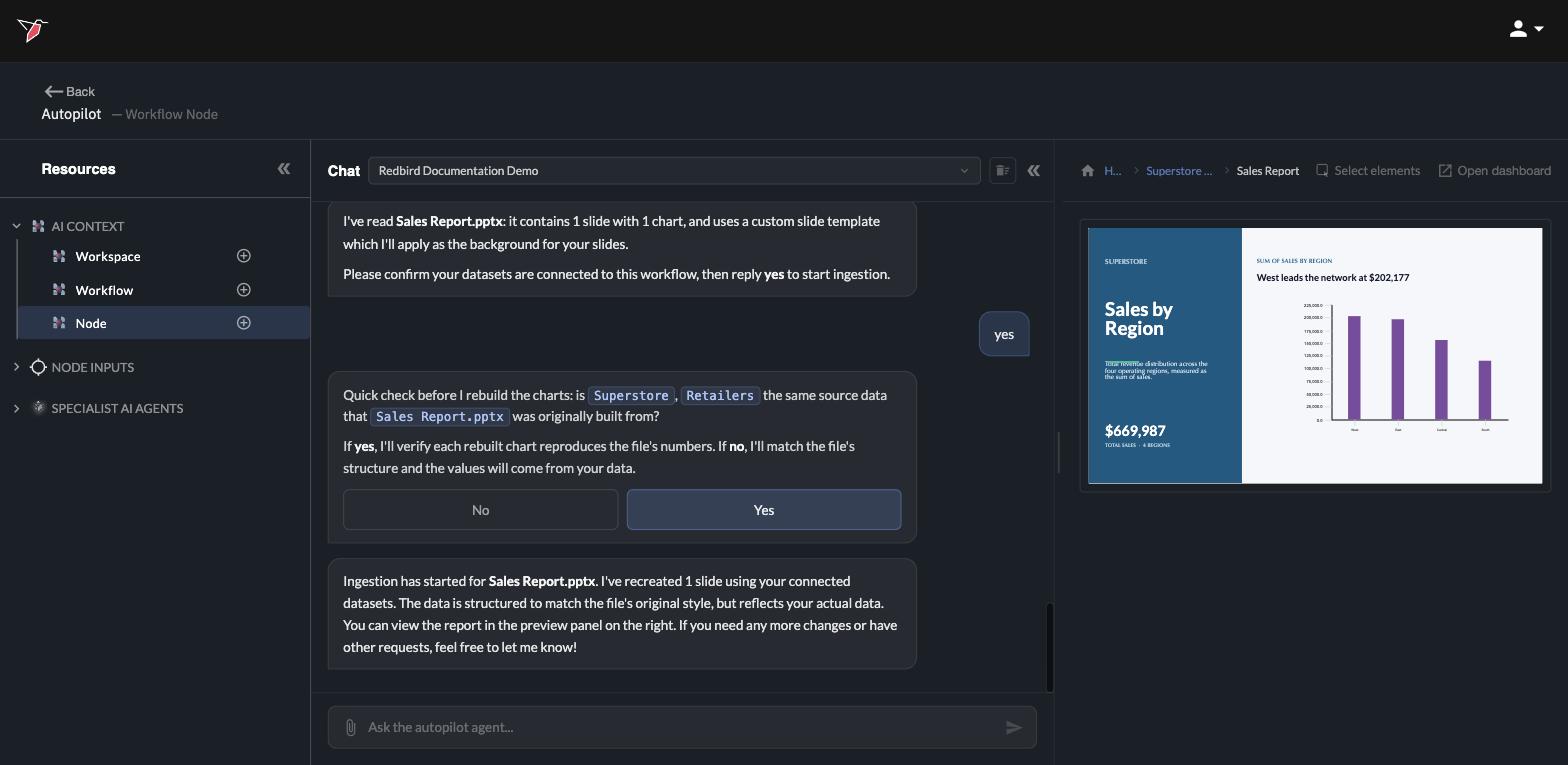
When the build finishes, the finished report appears in the preview panel — same look as the example presentation, but every figure comes from your data.
Two more things happened along the way:
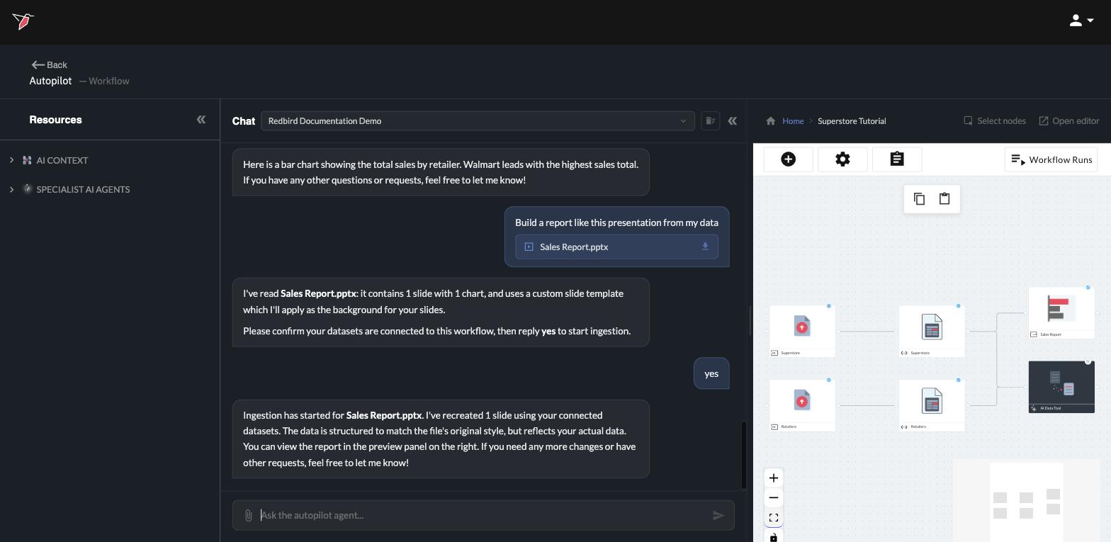
- A Sales Report node was added to your workflow canvas, connected to your data. The report is now part of the workflow itself.
- Click any slide directly in the preview (or click Open report at the top, then the slide) to open the slide editor view, where you can touch up anything by hand using point-and-click editing — adjust styling and colors, rewrite headlines and text, add filters, or change how a chart's numbers are calculated, element by element. You can also make changes by describing them in a chat message, and Autopilot will do the work for you.
The report stays current. Because the report is a node in your workflow, it isn't a one-time export — when the workflow runs again with fresh data, the report's charts and figures update to match. Learn more in the reporting guide once you've finished the tutorial.
What you built — and what's next
That's the complete journey: you uploaded two files, cleaned and combined them, explored them in conversation, and produced a presentation-ready report — all by telling Autopilot what you wanted.
From here, explore what else you can automate: the Automating with Redbird guides cover everything in more depth — from talking to Autopilot and building workflows to connecting your own tools and generating reports.
Updated 4 days ago