Dashboard - Charts and Tables
Background
When analyzing data, charts, and tables are powerful tools you can use to visualize data and pull out insights. Redbird's dashboard builder allows you to create custom and interactive charts, and tables, with advanced formatting options so you can customize them to get the exact look and feel you want.
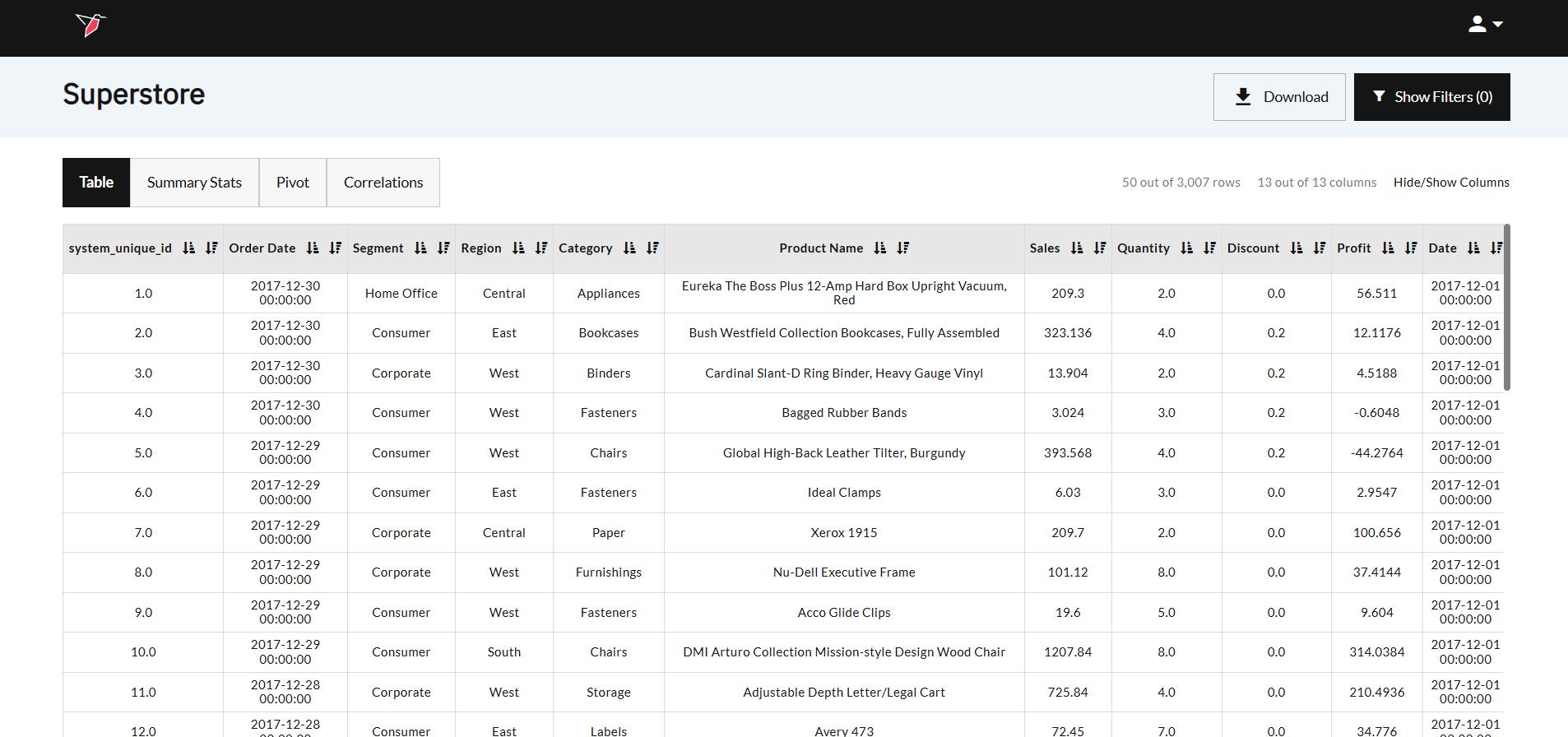
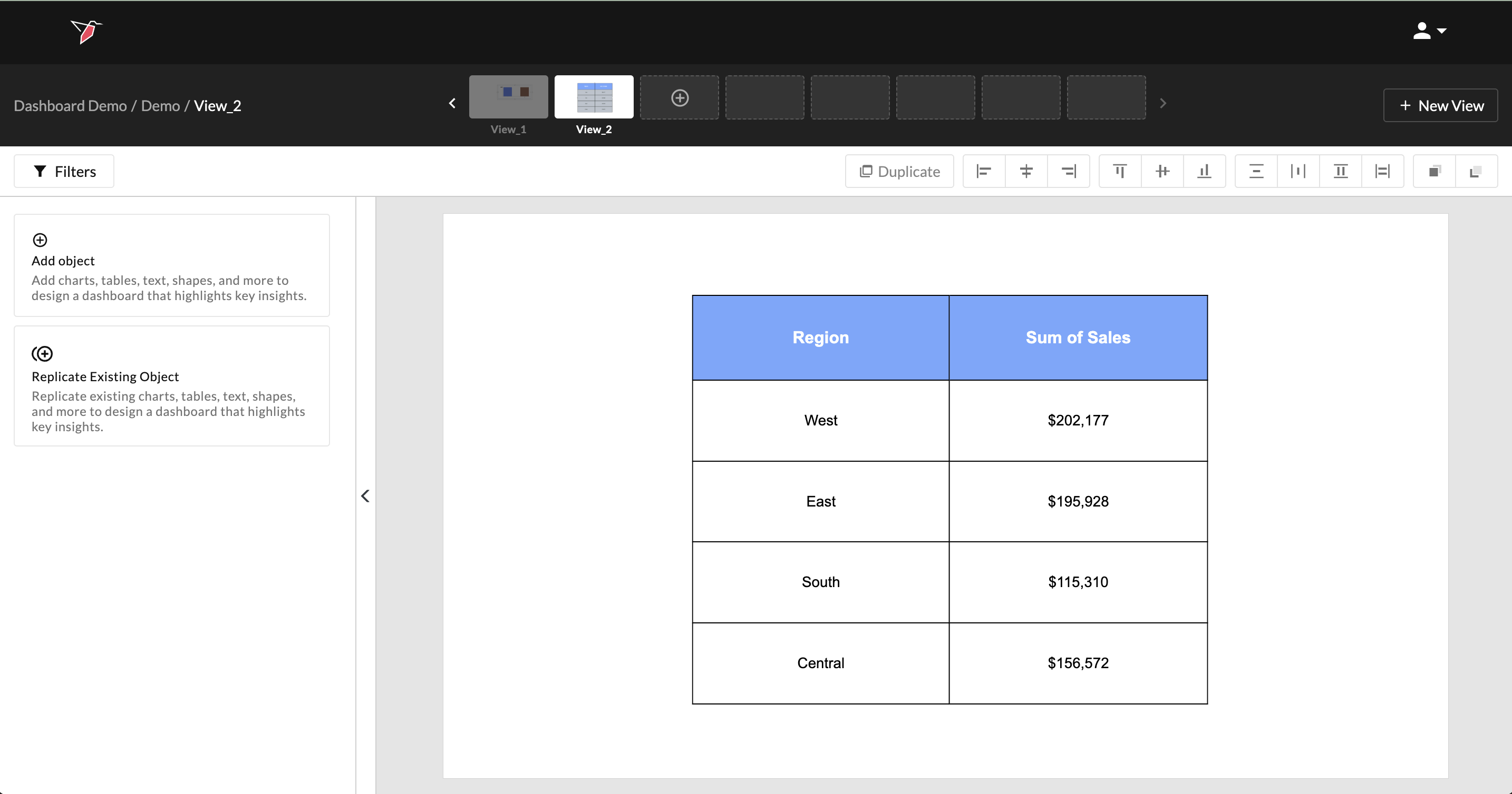
To understand how you can visualize data loaded to Redbird, let’s look at an example. The screenshot below shows historical sales data from an office supplies store.
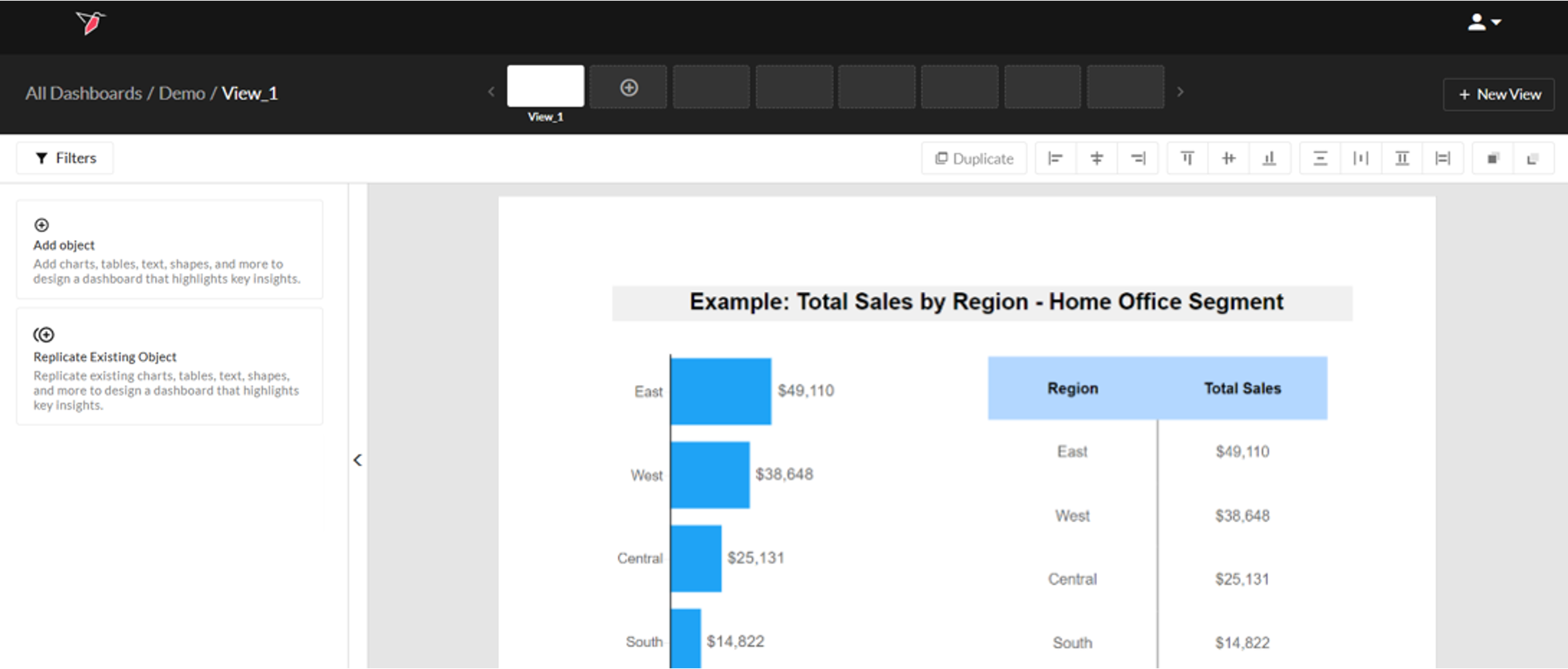
Let’s say you want to visualize the sales by Region in the Home Office segment. You can do this using a bar chart or a table which will look like the screenshot below. We will recreate this example in this article.
Adding a Chart or Table to the Workspace
Charts and tables are a great way to summarize or visualize your data. In our example, we are going to look at the total sales in the “Home Office” segment broken down by region. To add a chart or table to the workspace, do the following:
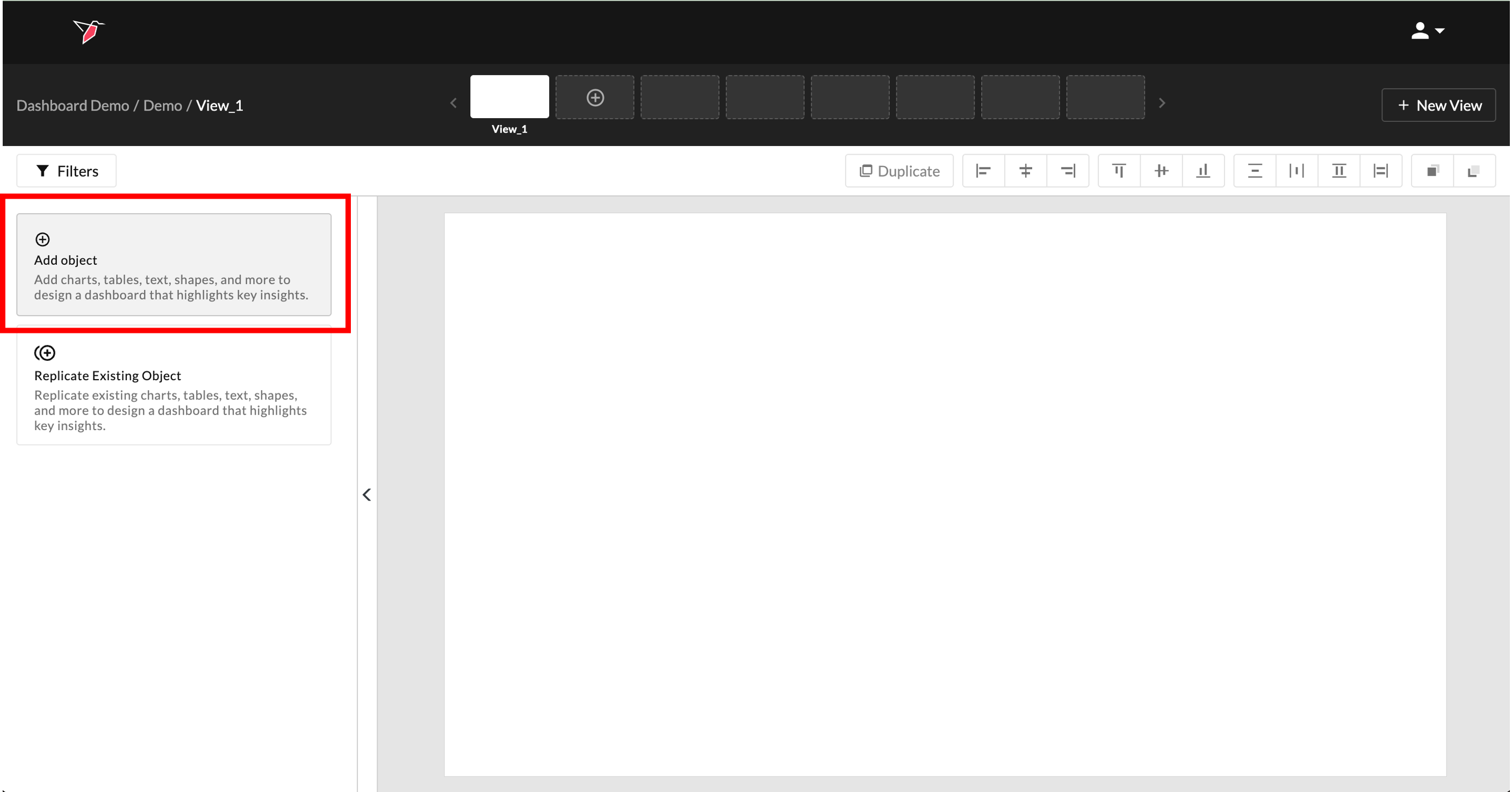
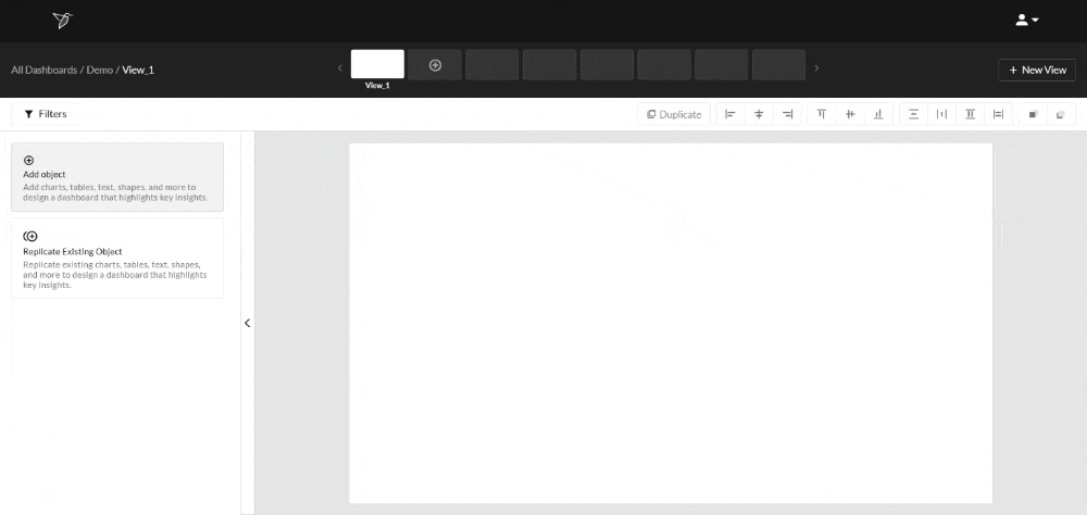
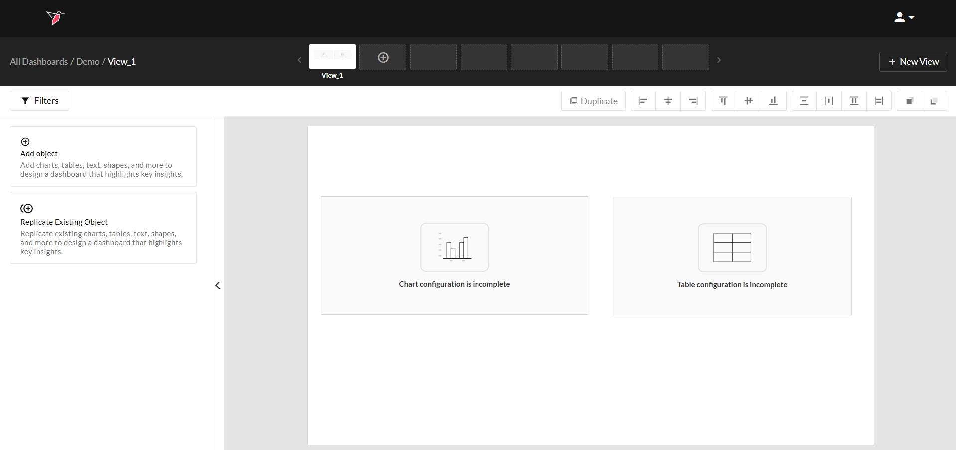
- Click Add Object from the Actions Panel to activate the Object Library.
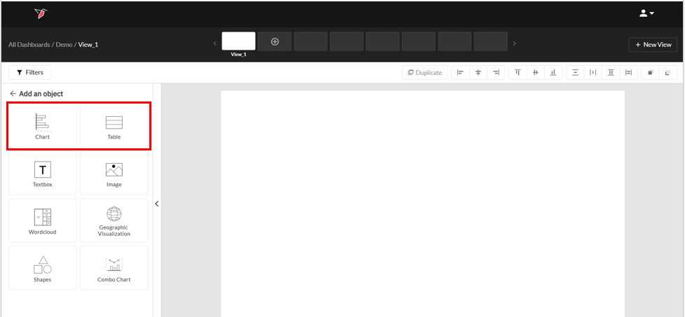
- Then, click Chart to add a chart or Table to add a table.
- A modal will appear for you to configure the general settings which consist of naming the object, selecting a dataset and choosing a table or chart type. Select the dataset you want to use to generate your chart or table from the Dataset dropdown.
You will see an object informing you that the object's configuration is incomplete. Once you finish configuring the other chart or table settings, the object will render on the page.
- For charts, you can choose any of the chart types supported by Redbird. For this example, click Cluster Bar and name it "Total Sales by Region".
- For tables, you can either add a table with horizontal columns or vertical columns. For this example, click Vertical Categories.
Configuring a Chart
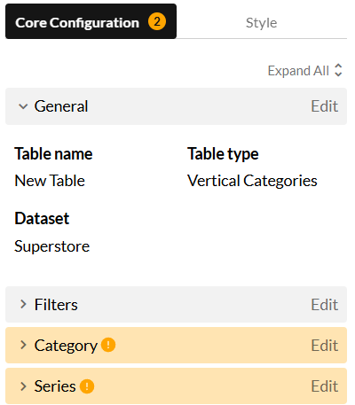
The Core Configuration drop-downs look similar for both charts and tables and contain the "logic" to visualize the data. There are 6 steps as outlined below.
Required fields are yellow when you add an object to the canvas to alert users that it needs to be configured for the object to render.
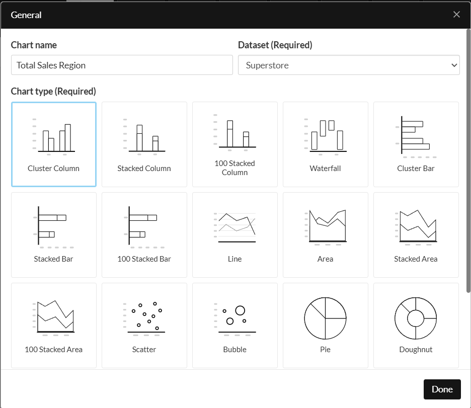
Step 1: General Settings
This section contains metadata about the chart which you can customize. Please see below for the complete list of fields:
- Chart name: This field lets you customize the name of the chart, so you can easily reference it elsewhere, like replicating it on a different view. You can also select the dataset and the chart type.
- Chart type: This field lets you change the chart type, i.e. from a bar chart to a column chart and vice versa, for example.
- Dataset: This field lets you pick the dataset that you want to use to generate your chart. You can change the dataset in the future by updating it here.
Step 2: Adding Filters
This section allows you to add filters to the chart. In this example, we want to visualize sales for the "Home Office" segment. Follow the steps below to add the filter:
- Click Edit on the Filters drop dropdown.
- Select Segment from the column dropdown.
- Now select " =" from the operator dropdown.
- Then select Home Office from the values dropdown.
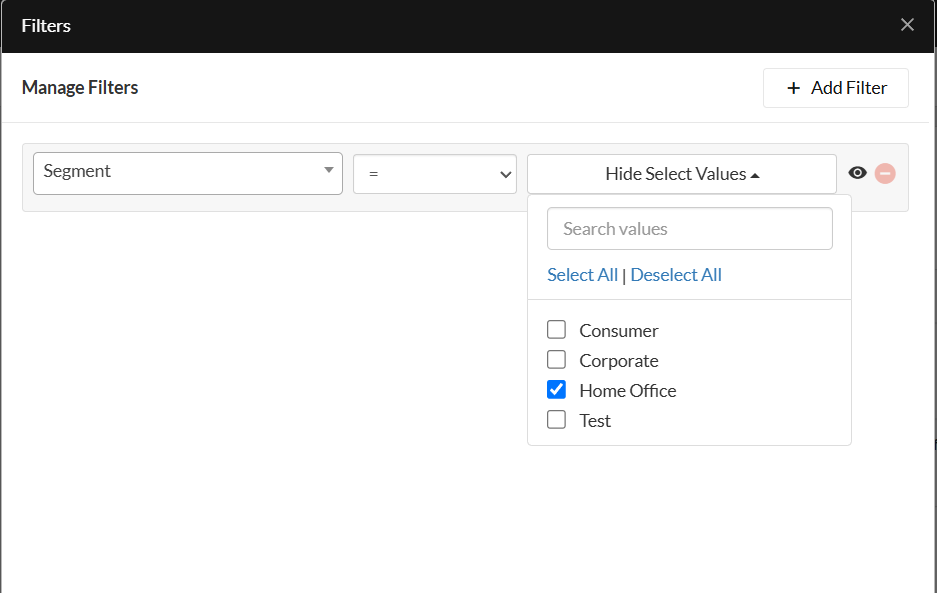
Filter Visibility
The filters added in this section can be made visible or invisible by clicking the Eye icon on the right-hand side of the filter.
- If a filter is visible, this means that the filter can be changed from outside the configuration page, within the Actions Panel on the dashboard workspace.
- If a filter is invisible, it can only be changed from within the configuration page.
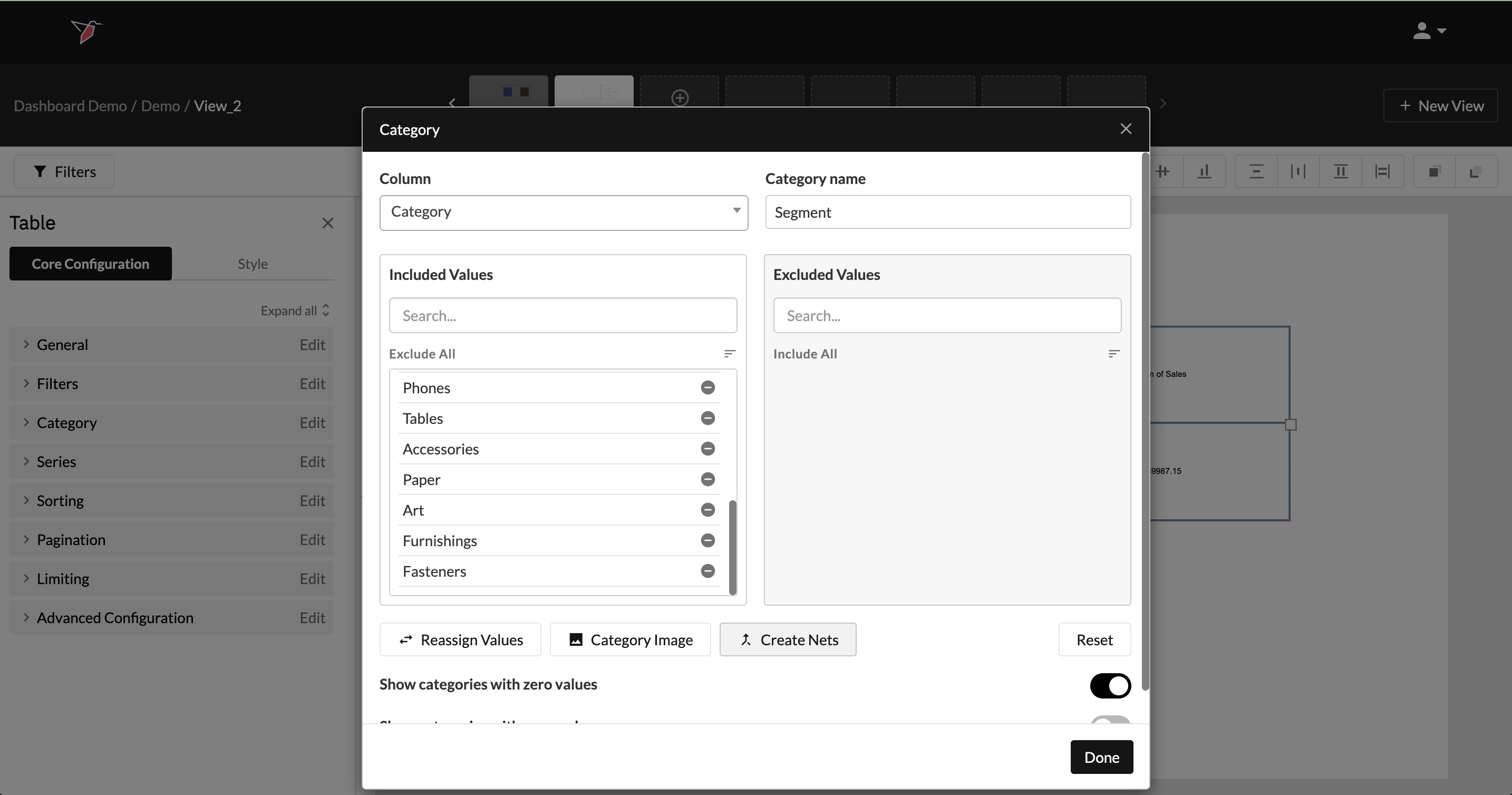
Step 3: Setting up Categories
The Category lets you choose the categories that you want to visualize on the chart. If you do not want to chart categories you can skip to step 4. In this example, we want to look at the different regions, so choose Region from the column dropdown.
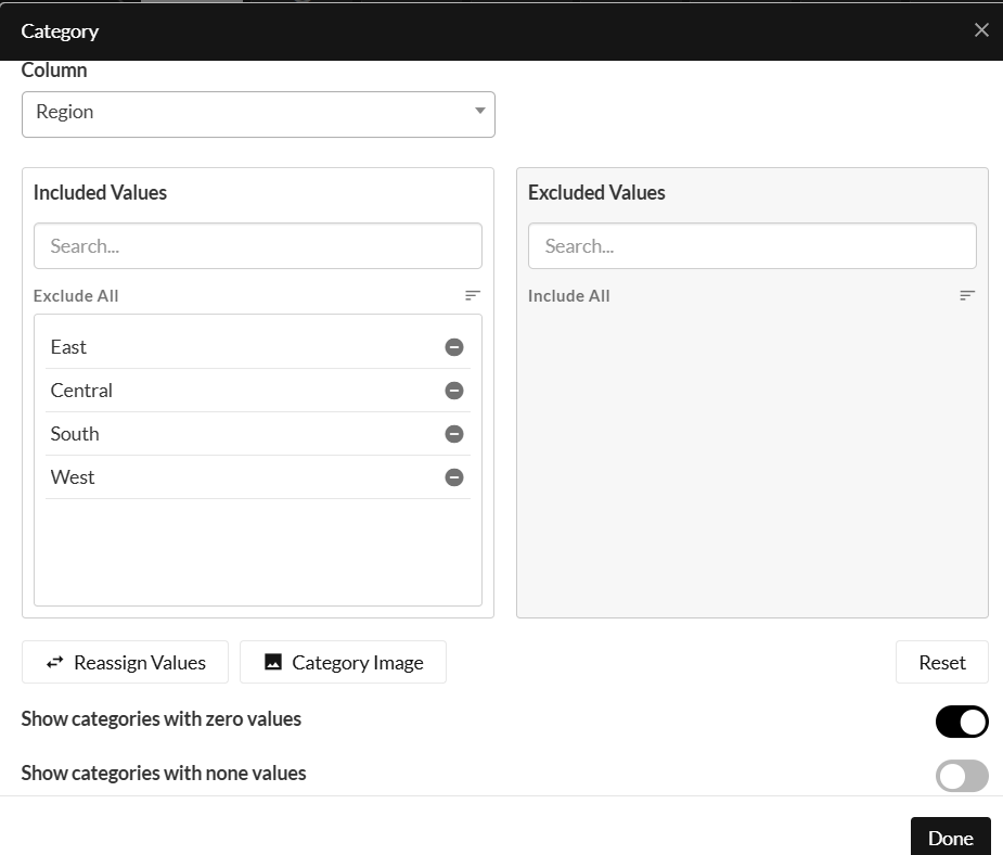
This section also lets you do the following actions:
- Include / Exclude categories: You can exclude categories from being charted by clicking the minus sign next to the value, and add them back by clicking on the plus sign. You can also bulk include or exclude by using the actions by selecting Exclude All or Include All.
- Sort Categories: You can customize the order in which the categories will be displayed in a chart by clicking and dragging them. You can also use the sort button to sort the categories.
- Rename Categories: You can customize how the category text renders on the chart by clicking the Reassign Categories icon. This opens a pop-up showing the included categories, which you can rename as desired. You can also save this mapping to be reused on other charts if needed.
- Category Image: If you want to generate images instead of the category names, you can select the Category Image button and upload the images. Either upload an image or specify an image URL to map to the category.
You can even save this mapping to be used on other charts if needed
Step 4: Configuring Series
After setting up the categories, you need to configure series, which is the calculation that is performed on the data. In general, you can configure series in three ways:
- Single series: This configuration contains only one calculation that will be shown on the chart. For example, calculating the sum of sales by category.
- Single series with a split: This configuration contains one calculation that is split by another dimension. For example, calculating the sum of sales by category split by department.
- Multiple series: This configuration contains multiple calculations that will be shown on the chart. For example, calculating the sum of sales and total profit by category.
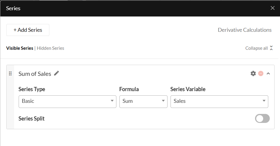
In this example, we want to visualize the sum of Sales by Region. To do this, follow the steps below:
- Click Edit on the Series dropdown and click Add Series.
- Provide a name for the series. "Sum of Sales" for example.
- Next, select Basic from the Series Type dropdown. This allows you to use predefined formulas supported by Redbird. You can also configure Advanced Formulas, please read this article for more information.
- Now, choose a formula from the dropdown. In this case, choose Sum.
- Choose the Series Variable from the dropdown. In this case, choose Sales.
- Next, depending on your configuration you can choose to add a split by toggling the Series Split option and providing the split variable like department.
- You can also add another series by clicking Add Series.
- If you have multiple series you can reorder by grabbing the 6 dots on the left-hand side of the series and moving the series to the desired location
Specific Information for Scatter and Bubble Charts:
- A scatter chart is a data visualization that plots the relationship between two variables as individual data points. Each point is positioned based on its values along the horizontal (X) and vertical (Y) axes.
- A bubble chart extends the scatter chart by representing a third variable through the relative size (Z) of each bubble, in addition to the X and Y positions.
Working with Scatter and Bubble Charts
- For both chart types, you only need to define a series—there’s no need to select a category.
- To apply calculations to series values (e.g. Sum, Mode, Max, Min), toggle on Aggregated Values at the top of the series settings. You can then select the desired formula for both X and Y (and Z for bubble) values using the Formula dropdowns or by entering an advanced formula. If you leave Aggregated Values turned off, the chart will plot the raw values for each axis.
- To compare different combinations of X, Y (and Z for bubble) values (e.g. for different competitors), you can: Add another series using Add Series, then apply filters to each using the settings cog, or use the series split functionality.
- You can also apply filters and distinct value calculations at the dimension level (X, Y, or Z) by clicking the cog icon next to the corresponding dimension.
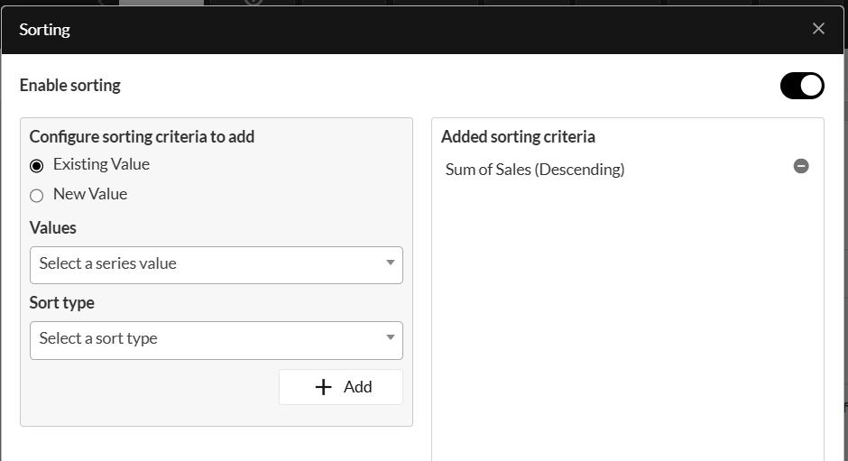
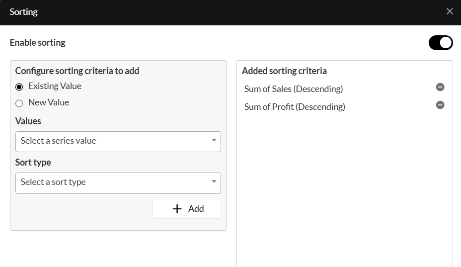
Step 5: Sorting
This section allows you to sort the categories based on a calculation. You can sort the data in two ways, based on an existing series being visualized or on a different series that is not visualized.
In this example, we are visualizing the sales by region. To sort this in descending order, do the following:
-
Enable sorting by clicking on the toggle.
-
Select Existing Value.
-
Choose the series value from the dropdown, in this case, choose Sum of Sales.
-
Next, choose whether you want to sort by ascending or descending order from the Sort Type dropdown.
-
Finally, click Add.
You can also sort the data by a different series that is not being visualized. For example, if you want to sort the sum of sales by region in descending order of profit, do the following:
-
Click New Value.
-
Choose Sum from the Formula dropdown.
-
Choose Profit from the Calculation variable dropdown.
-
Choose whether you want to sort by ascending or descending order from the Sort type dropdown.
-
Provide a name for this sorting criterion. For example, "Sum of Profit".
-
Finally, click Add.
-
You can add multiple sorting criteria to break ties by following steps 1 - 6.
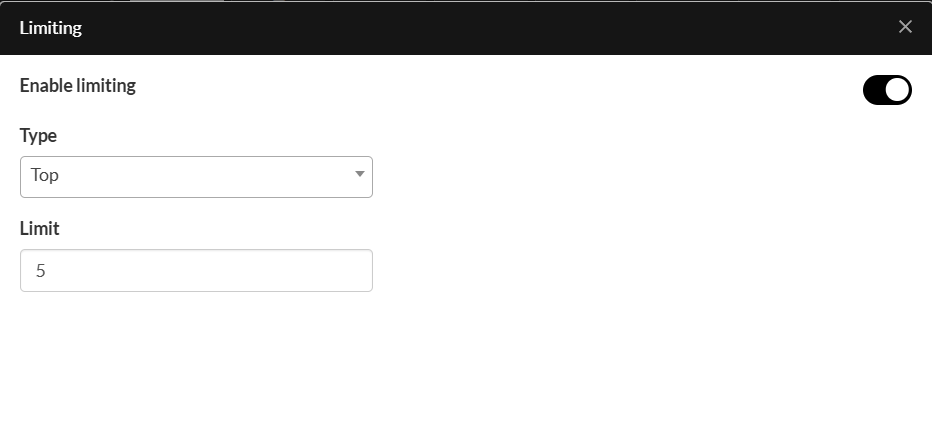
Step 6: Limiting
Once you have added the sorting criteria, you can choose to limit the data. For example, showing the top five categories. To apply limiting, do the following:
- Enable limiting by clicking on the toggle.
- Top categories are selected by default, to toggle to the bottom categories click Top.
- Provide the number of categories you want to show.
You've now configured all of the settings to render the chart. For styling, continue to the next section.
Formatting Charts
You can generally format charts in two ways:
- By modifying the chart colors, i.e. the colors of the bars, slices of a pie chart, etc.
- By modifying the chart style, i.e. the formatting of the data labels, axis labels, legend, etc.
Chart Colors
To modify chart colors, do the following:
- Click on the Style menu in the Actions Panel and then click the down arrow to expand the Chart Colors dropdown, or you can click on the bars which will automatically expand the actions panel to the relevant section.
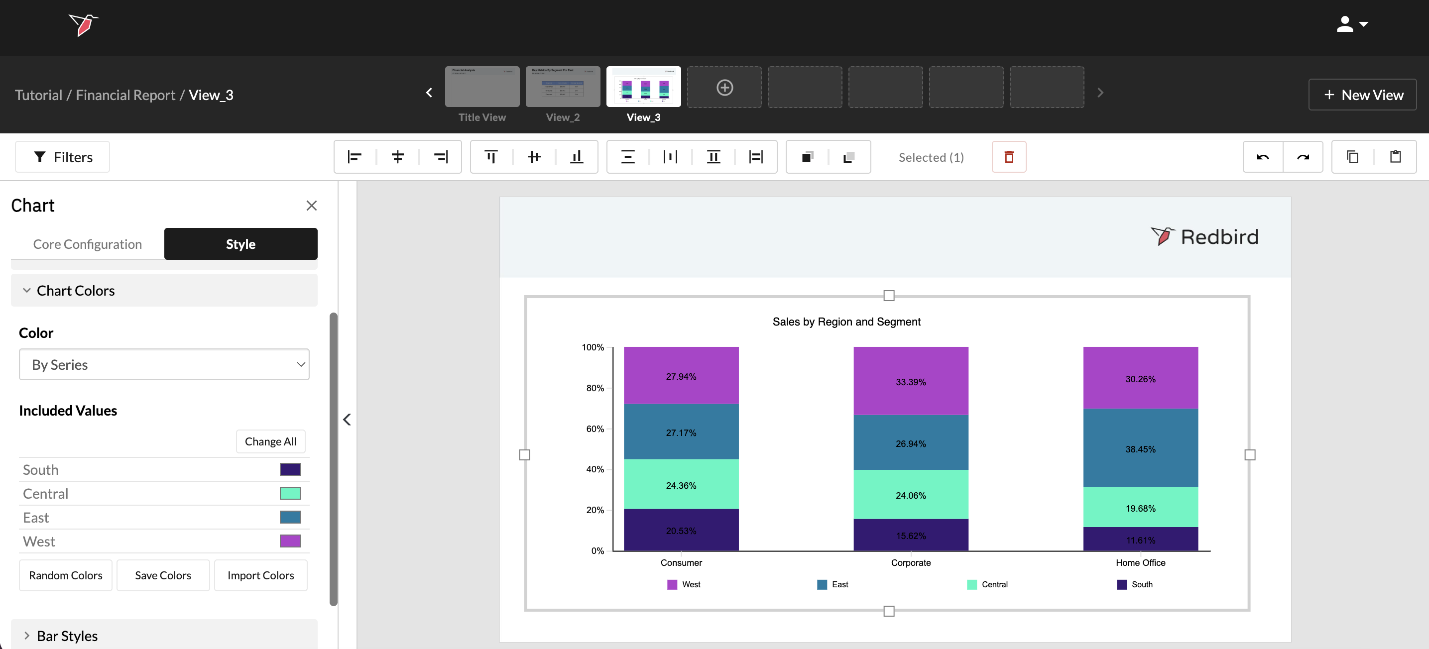
- Follow these steps to configure the colors:
- Use the Color dropdown to select By Category or By Series to assign colors based on categories or series values.
- Under Included Values select the color you want to assign to each value. There are 3 ways to update the colors.
- Click on the color next to the value to select a specific color from the selector.
- Click Random Colors and Redbird will randomly assign the colors for you.
- If you have color mapping saved from a previous chart configuration, you can use that in the current chart by clicking Import Colors.
- Clicking Change All will allow you to set all included values to a specific color.
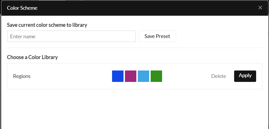
Using Color Palettes
You can also create a color scheme to assign certain colors to specific values to maintain a consistent look and feel throughout your dashboard. For instance, you may want brands to be represented by a certain set of colors. You can do this using Redbird's color palette feature.
To configure and save a color scheme, do the following:
- Assign colors to the categories/series.
- Next, click on the Save Colors which will open the color scheme modal.
- Provide a name for this scheme and click Save . You can now use this palette on another chart which uses the same category/series names, i.e., each color is now mapped to the name of the category/series label.
To use a saved color scheme, do the following:
- Click on the Import Colors
- Then click Apply on the right-hand side of the palette you want to apply. This will apply the colors based on the category/series labels.
Creating a Custom Chart Style
You can customize how chart elements look using chart styles. Elements of a chart include:
- Title
- Chart Area
- Plot Area
- Legend
- Data Labels
- Chart Colors
- Bar Styles
- Horizontal Axis
- Vertical Axis
To format these elements, expand the dropdown arrow next to the section you want to configure. Use the Expand All button to open all of the menus.
Configuring a Table
The process of configuring a table is the same as configuring a chart. The main difference is in the general selection you can name your table, select a horizontal or vertical orientation, and select a dataset.
One other key difference between charts and tables is that tables support the creation of “Nets” — custom values that group together two or more existing category or series split values.
- Within the Category or Series Spilt sections, click Create Nets.
- In the Netted Values modal:
- Give your Net a name
- Select the formula you wish to apply
- Select the values you wish to include
- Click the right arrow from the picker
- Click Done
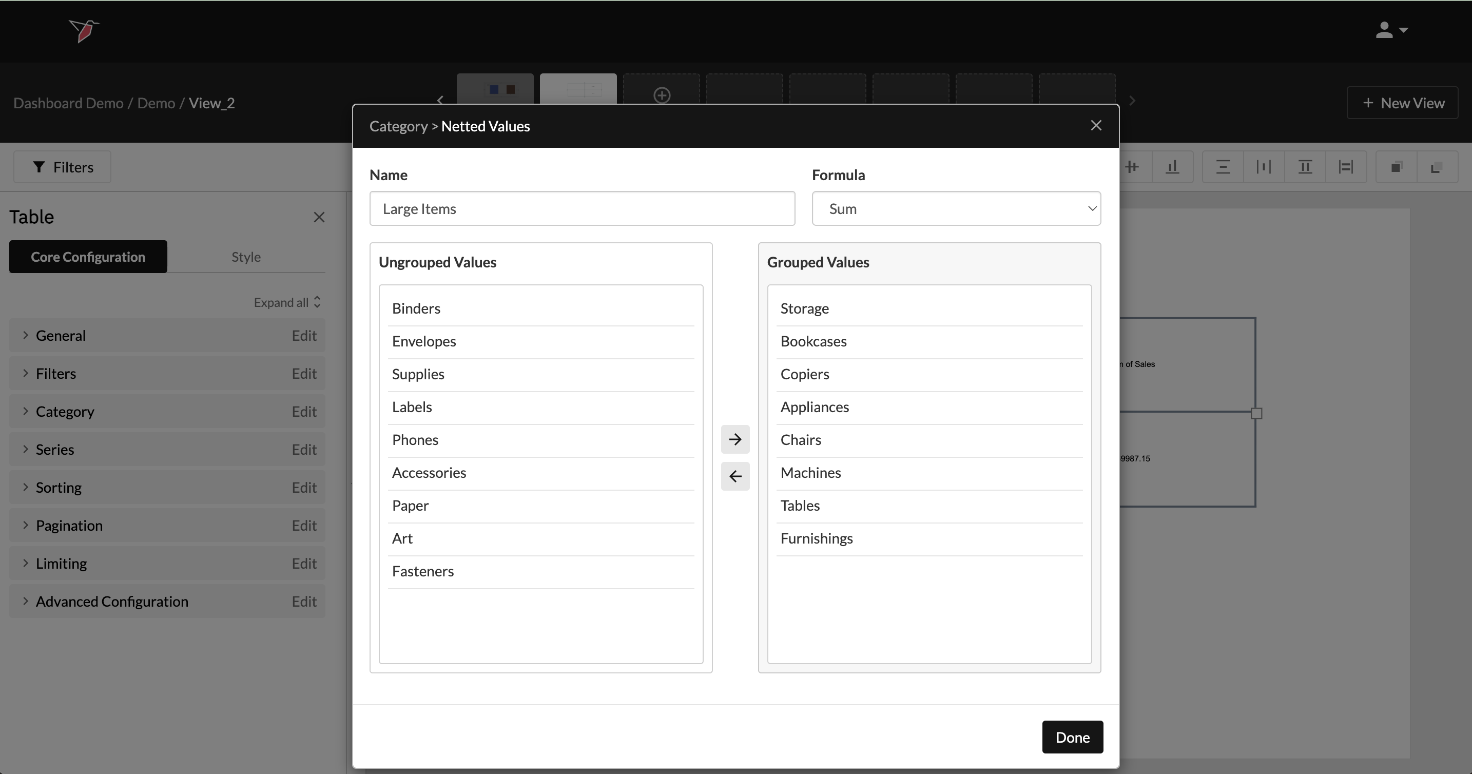
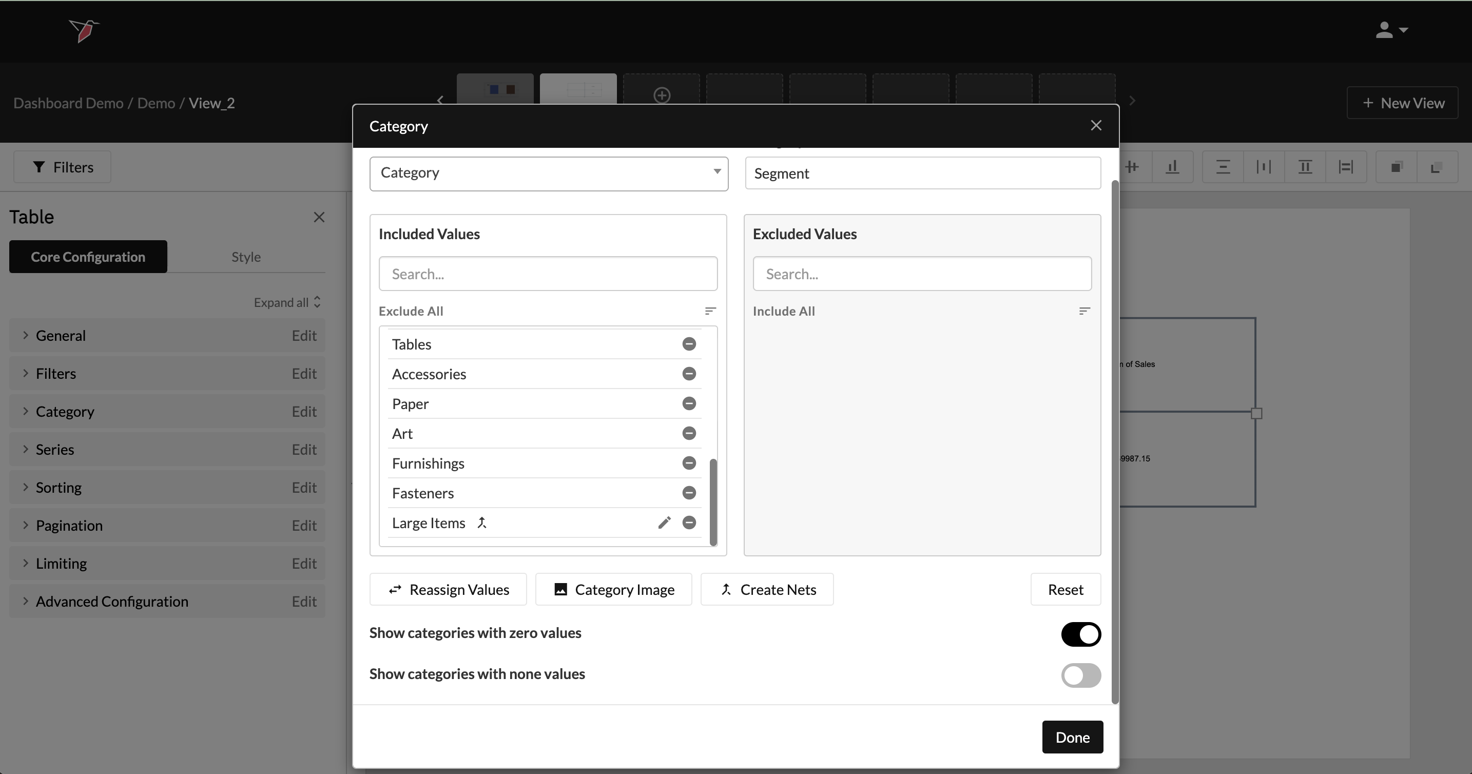
- You will see your 'Net' appear at the end of the list of Included Values. To edit it click on the pencil icon. It will also appear in your table as a new row/column.
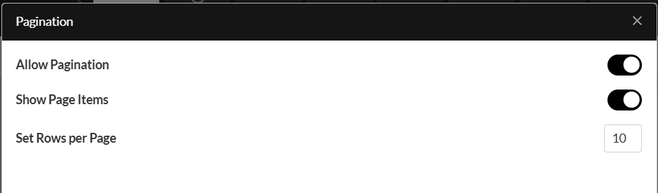
You can also add pagination to the table if you have a lot of category values. To add pagination:
- Click Edit on the Pagination menu
- Enable the toggle next to Allow Pagination
- If you want to show the number of items per page in the table, enable the toggle next to Show Page Items
- To set the number of items per page, enter a number in the box next to Set Rows per Page
Formatting Tables
Once you've configured a table, you can format the contents of the cells in two ways:
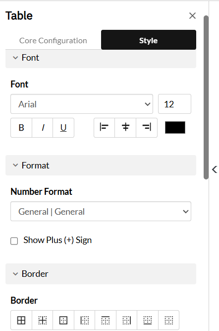
1. Basic Table Formatting
To apply formatting such as font size, number format, borders, etc., do the following:
- Select the object you want to add styling to
- In the Actions Panel, select Style
- Highlight the cells you want to format by clicking and dragging.
- Update the formatting by opening the menus and configuring the settings .
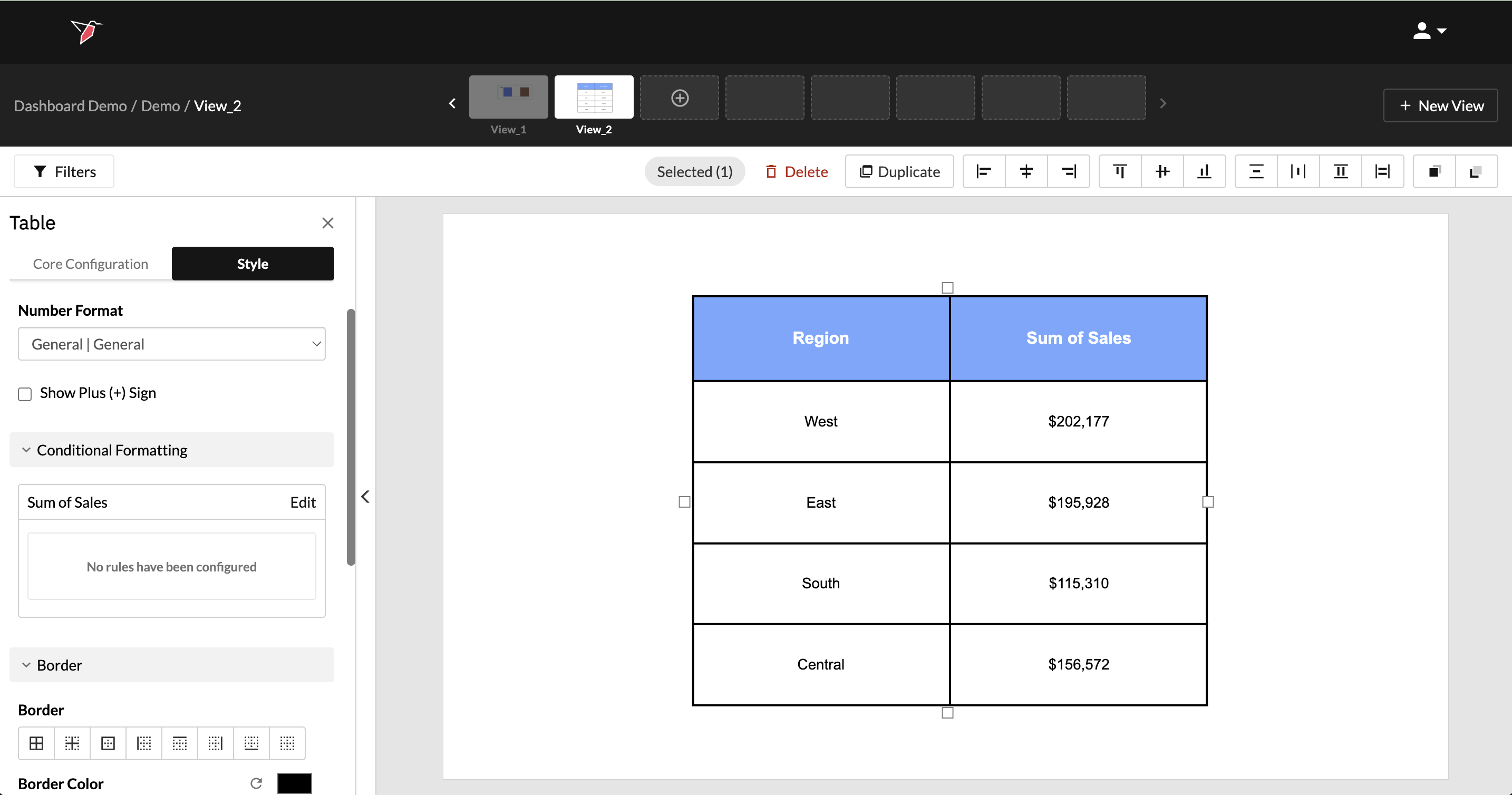
2. Conditional Formatting
You can also apply conditional formatting to highlight cells based on specific logic. For example, in a table showing total sales by region, you might want to draw attention to cells where sales exceed a certain threshold — such as a target value of $160,000.
To set up conditional formatting:
- Click on the table to select it.
- Navigate to the style tab of the Actions Panel.
- Navigate to the Conditional Formatting section and click Edit on the series you wish to apply the conditional formatting - in this case, there's only one: Sum of Sales.
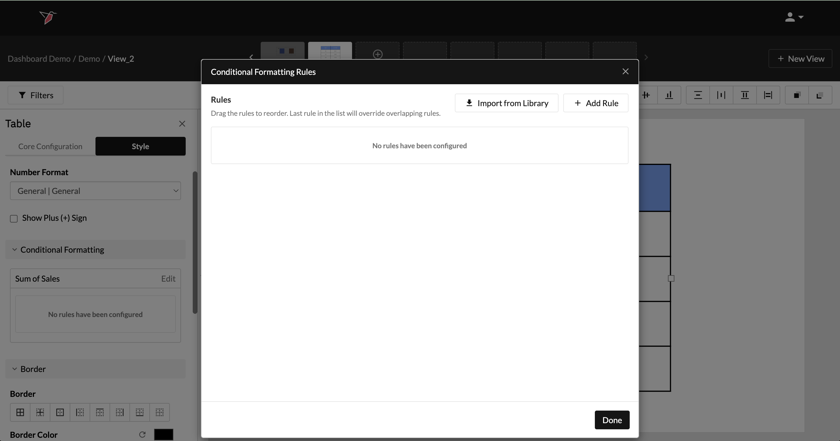
- In the Conditional Formatting Rules Modal, click Add Rule
- Give the rule a name.
- Under the Rules section, add filters to define the conditions for your formatting. When these conditions are met, the selected formatting will be applied.
- In the Filter Type dropdown, choose whether the rule is based on:
- Values from the series (e.g., sales amounts), or
- Significance tests (if applicable to your data).
- Switch to the Formatting section to define how the cell should appear when the rule is triggered. From the Display dropdown, you can choose:
- Original Content — keep the value but change the font, number format, cell background, border, etc.
- Icon — replace the content with an icon and optionally style the cell’s background and border.
- Blank Cell — hide the content but still apply background and border formatting.
In this example, you could choose “Values” as the filter type, then select the Sum of Sales series and set the condition to > 160,000. In the Formatting section, choose “Original Content” and then set the cell background color to green and the font style to bold.
- You can add multiple rules and drag them to reorder. Rules lower in the list take precedence and will override overlapping rules above them.
- (Optional) Save a rule to the library for reuse across other tables in any dashboard by clicking the up arrow icon on the rule. To reuse a saved rule, click Import from Library, then select the rules you want and click the Import icon next to each. Click Done when finished.
- Click Done to exit out of the Conditional Formatting Rules modal.