Sheets - Charts and Tables
Background
Redbird's Sheets app allows you to create custom charts and tables with advanced formatting options so you can customize them to get the exact look and feel you want. Redbird tables streamline the process of updating reporting making it more efficient than standard data refresh processes by connecting the raw data, data processing and sheets output via a workflow.
To understand how you can visualize data loaded to Redbird, let’s look at an example.
Note on Connecting Datests to Sheets:In order to be able to leverage other datasets within Sheets (for example to build dynamic tables), you will need to connect that dataset node into the Sheets node by drawing a line from the circle on the right-hand side of the dataset to the circle on the left-hand side of the Sheets node. A connecting arm will appear to indicate that the two nodes are now connected.
Adding a Table to the Workspace
In this example, we're going to make a table showing the Discounts by Segment using Redbird tables in a sheet. To add a table, follow these steps:
- Click Add Object in the Actions Panel
- Select Table to add a Redbird table to the Workspace
- Select the dataset you want to use to generate your table from the Dataset dropdown. You can also replicate a table from another dashboard or sheet by clicking Replica and specifying the dashboard/workbook, slide/sheet and object name.\
- Once you select the dataset, you can add either a standard or pivot table. We selected Standard for this example which will bring you to the configuration page.
Configuring a Table in Sheets
The configuration page provides the logic needed to generate a Redbird table using the selected dataset. The steps are outlined below.
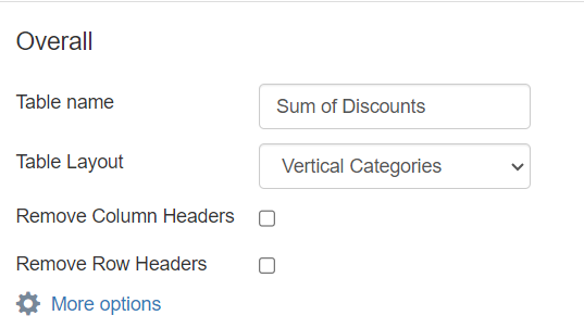
Step 1: Overall Settings
Please see below for a full list of the fields:
- Table name: This field lets you customize the name of the table, so you can easily reference it elsewhere, like replicating it on a different sheet, for example. For this example, let's call this table "Sum of Discounts"
- Table Layout: This allows you to configure the categories in the table vertically or horizontally.
- Remove Column Headers/Remove Row Headers: Select these check boxes if you want to remove the column headers or row headers, respectively.\
 \
\
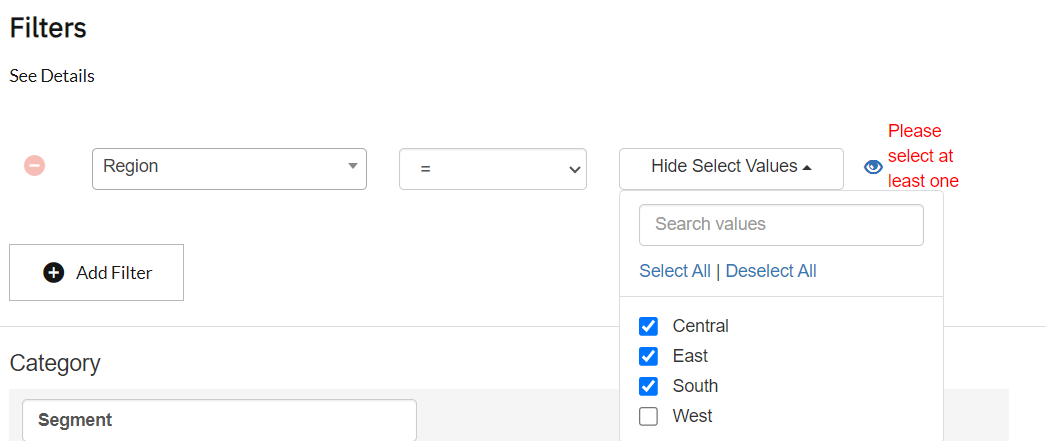
Step 2: Adding Filters
This section allows you to add filters to the table. In this example, we want to visualize sales for certain regions. Follow the steps below to add the filter:
- Click Add Filter.
- Select Region from the column dropdown.
- Now select "=" from the operator dropdown.
- Then select Central, East, and South from the values dropdown.\
 \
\
Filter Visibility
The filters added in this section can be made visible or invisible by clicking the Eye icon on the right-hand side of the filter.
- If a filter is visible, this means that the filter can be changed from outside the configuration page, within the Actions Panel. Read this article for more information.
- If a filter is invisible, it can only be changed from within the configuration page.
Step 3: Setting Up Categories
Next, you can choose the categories that you want to visualize on the table. If you do not want to create any categories you can skip to step 4. In this example, we want to look at the different segments, so choose Segment from the column dropdown.
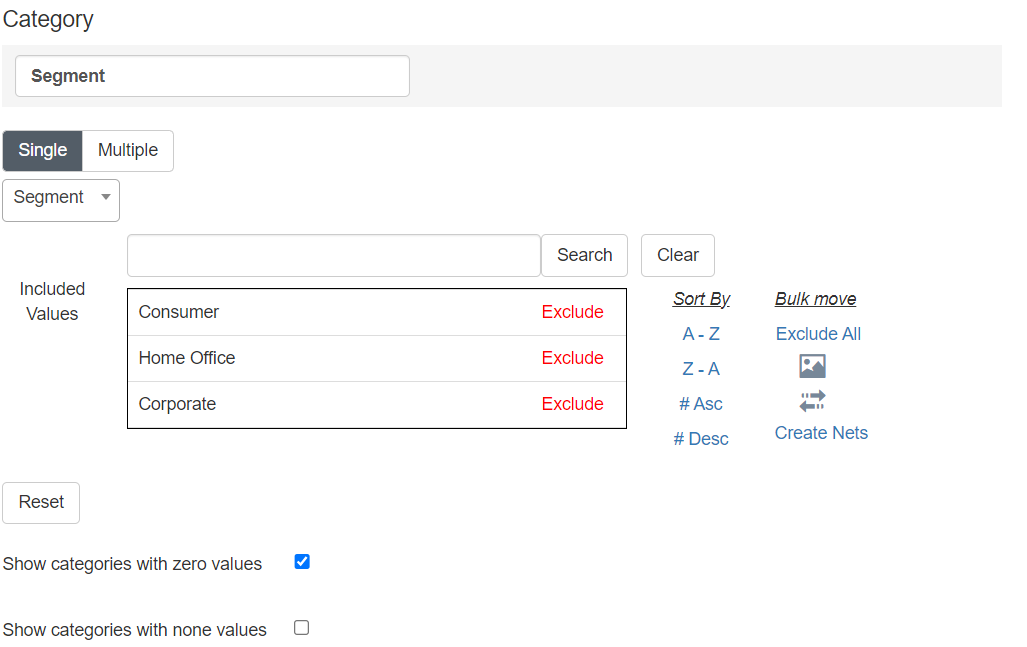
This section also lets you do the following actions:
- Include / Exclude Category Values: You can exclude values from you category by clicking Exclude, and add them back by clicking on Include (on the excluded value). You can also bulk include or exclude by using the actions within Bulk Move.
- Sort Category Values: You can customize the order in which the category values will be displayed in a table by clicking and dragging them. You can also use the A-Z / Z-A sorting options to sort them in alphabetical order, and the #Asc / #Desc options to sort values by smallest to largest or vice versa.
- Rename Category Values: You can customize the way the category value text is rendered on the table by clicking on the Reassign Category Values icon (double arrows) on the right-hand side of the category list. This opens up a pop-up which you can use to rename them as desired. You can also save this mapping to be reused on other tables, if needed.\
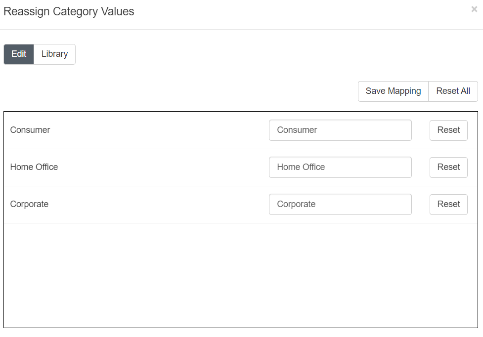 \
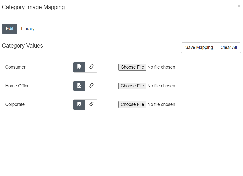
\ - Assign Images to a Category Value: If you want to show images as category value labels, you can click on the Category Value Images icon (image) on the right-hand side of the category list. This opens a pop-up that allows you to either upload an image or specify an image URL to map to the category value. You can even save this mapping to be used on other tables if needed.\
 \
\
Step 4: Configuring Series
Next, the series can be configured using the steps in this section. A series is a calculation that is used to generate the data in the table. In general, you can configure series in three ways:
- Single series: This configuration contains only one calculation that will be shown on the table. For example, calculating the sum of discounts by category.
- Single series with a split: This configuration contains one calculation that is split by another dimension. For example, calculating the sum of discounts for each category split by department.
- Multiple series: This configuration contains multiple calculations that will be shown on the chart. For example, calculating sum of discounts and total profit by category.
In this example, we want to look at the sum of discounts by Segment. To do this, follow the steps below:
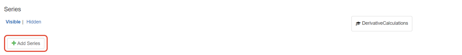
- Click Add Series.\
 \
\ - Provide a name for the series. "Sum of Discounts" for example.
- Next, click Basic. This allows you to use predefined formulas supported by Redbird. You can also configure Advanced Formulas, please read this article for more information.
- Now, choose a formula from the dropdown. In this case, choose Sum.
- Choose the Series Variable from the dropdown. In this case, choose Discount.\
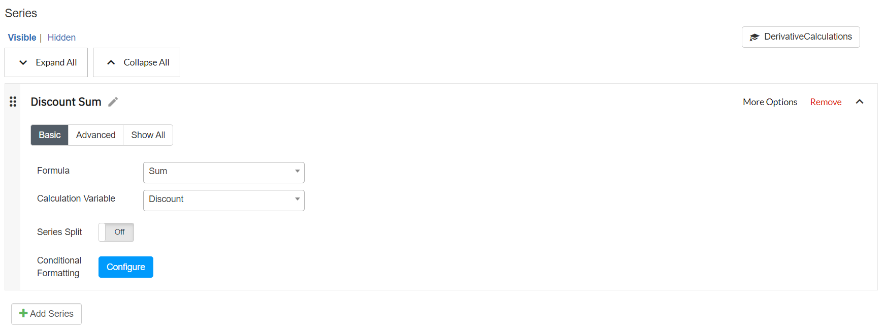 \
\ - Next, depending on your configuration you can choose to add a split by toggling the Series Split option and providing the split variable like department.
- You can also add another series by clicking Add Series. You can also drag to reorder series.
- You can add specific filters to the Series if required through the More Options
Step 5: Conditional Formatting
You can also apply formatting based on some conditional logic. For example, if you want to highlight a cell green if the sales are greater than 0. To set up conditional formatting, do the following:
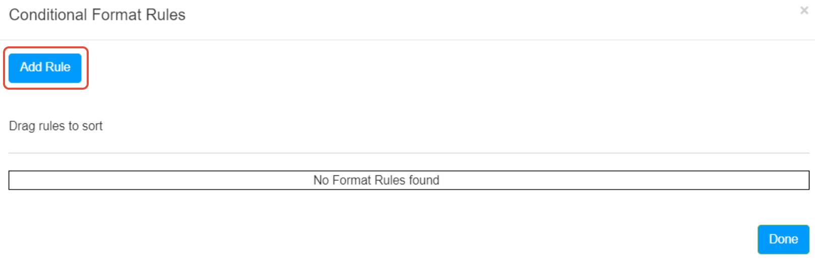
- Navigate to the series section and click Configure next to Conditional Formatting.
- On the pop-up, click Add Rule.\
 \
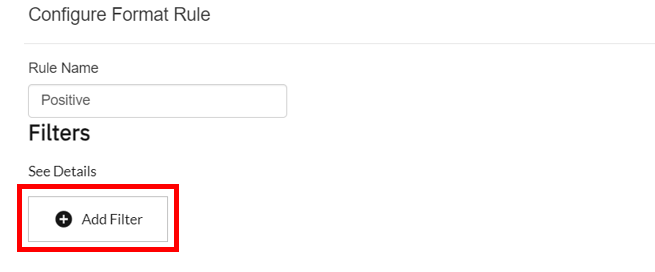
\ - On the following pop-up provide a name for the rule.
- Next, click Add Filter to set the condition(s) using filters.\
 \
\ - The condition we want to set for this example is the value of series Sales > 0. To do this, select the filter type as Series.
- Select the series named Discount Sum.
- Select the operator as >.
- Set the value to 0.
- Now set the number format as Currency, and the background color as green.
- Click Save.\
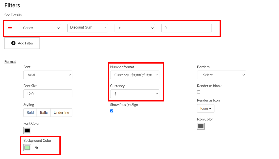 \
\ - Now, click Done.
- Finally, click Save and Refresh at the top of the page.
Step 6: Sorting and Limiting
This section allows you to sort and limit the categories based on a calculation. You can sort the data in two ways, based on an existing series being visualized or on a different series that is not visualized.
In this example we are visualizing the discounts by segment. To sort this in descending order, do the following:
- Enable sorting by clicking on the toggle.
- Click Existing Value.
- Choose the series value from the dropdown, in this case choose Discount Sum.
- Next, choose whether you want to sort by ascending or descending order from the Sort Type dropdown.\
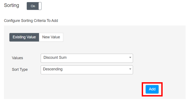 \
\ - Finally, click Add.
You can also sort the data by a different series that is not being visualized. For example, if you want to sort the sum of discounts by segment in descending order of profit, do the following:
- Click New Value.
- Choose Sum from the Formula dropdown.
- Choose Profit from the Calculation Variable dropdown.
- Choose whether you want to sort by ascending or descending order from the Sort Type dropdown.
- Provide a name for this sorting criterion. For example, sum of sales.
- Finally, click Add.\
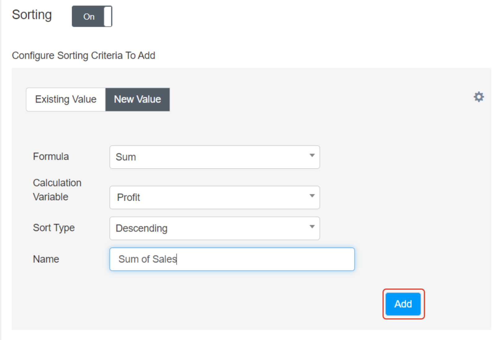 \
\ - You can add multiple sorting criteria to break ties by following steps 1 - 6.
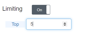
Limiting Data
Once you have added the sorting criteria, you can choose to limit the data. For example, showing the top five category values. To apply limiting, do the following:
- Enable limiting by clicking on the toggle.
- Top category values is selected by default, to toggle to the bottom category values click Top.
- Provide the number of category values you want to show.\
 \
\
Finally, click Save and Refresh to apply the configuration to the table.
Step 7: Managing Tables
In the Actions Panel, the Manage section provides a list of the Redbird table objects in the Workspace. Using this list, you can refresh (when new data is available), edit or delete the tables using the respective arrow, pencil and minus icons.
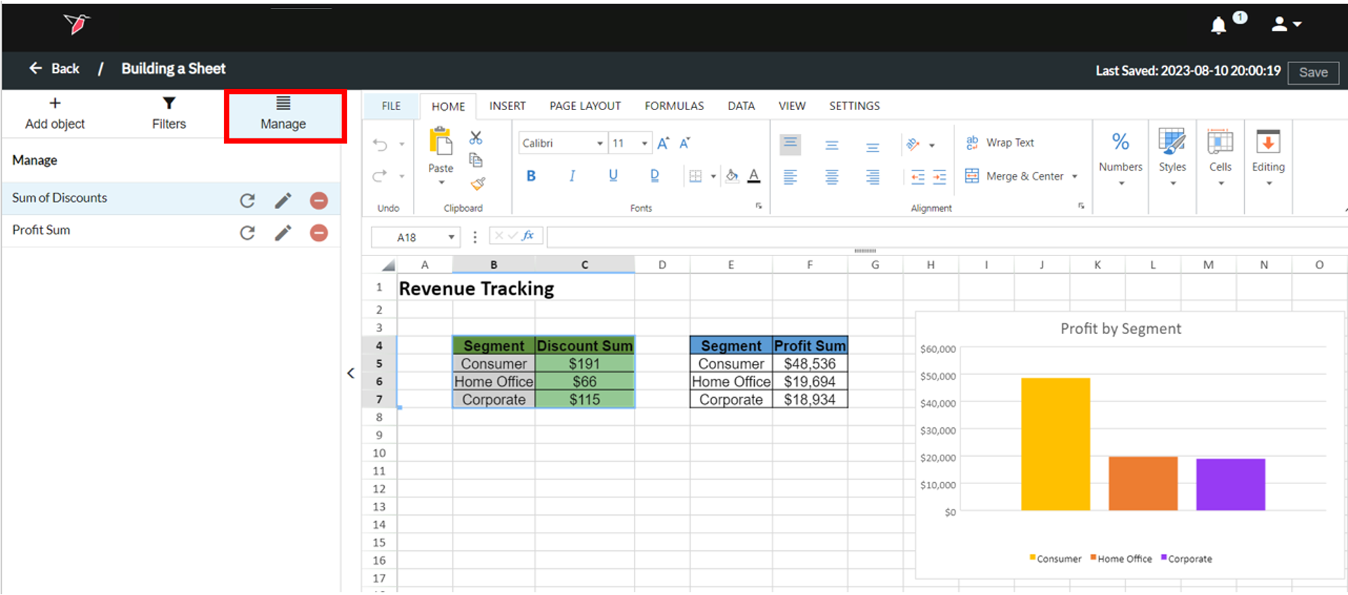
Note:If you select the name of a table in the Manage section, it will highlight it in the Workspace.
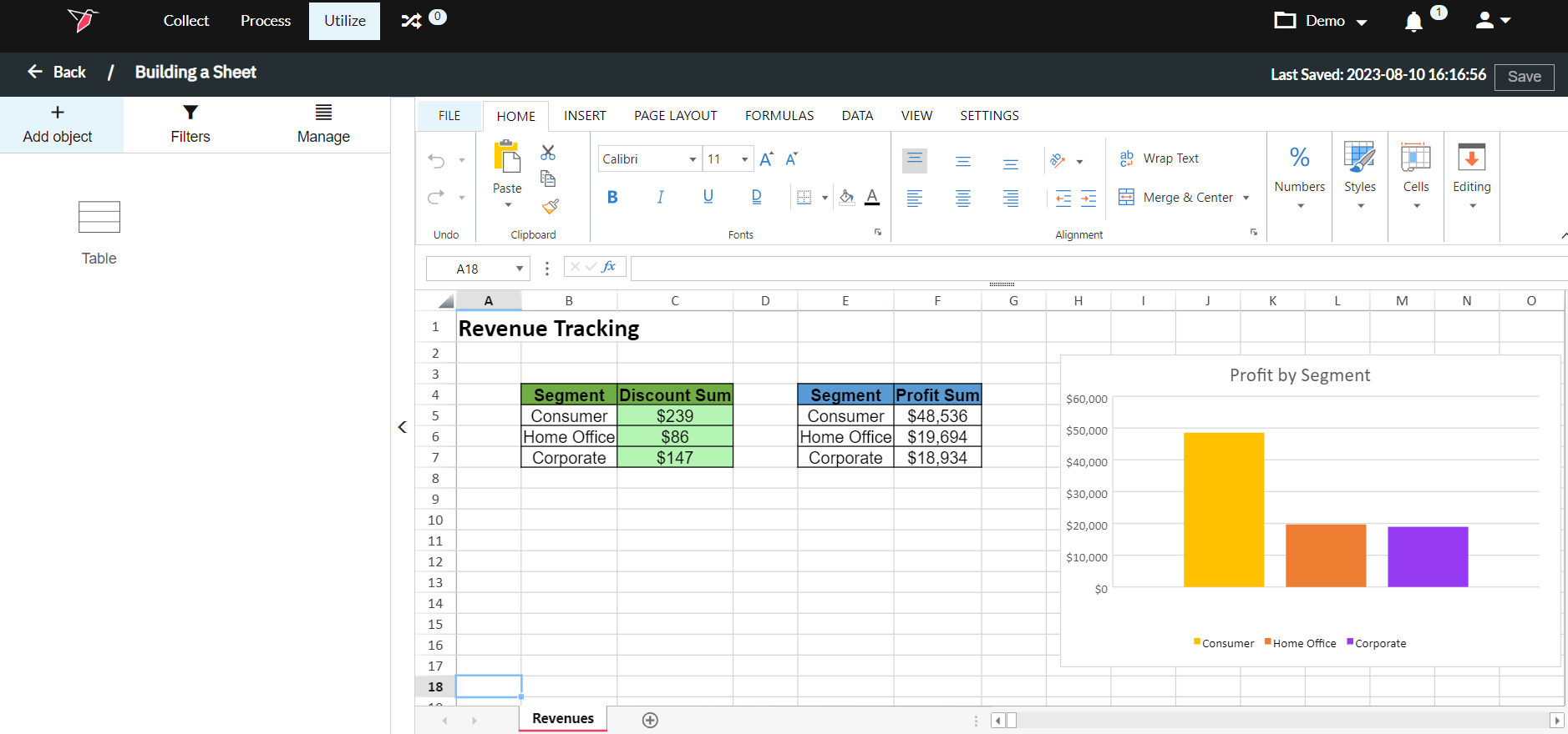
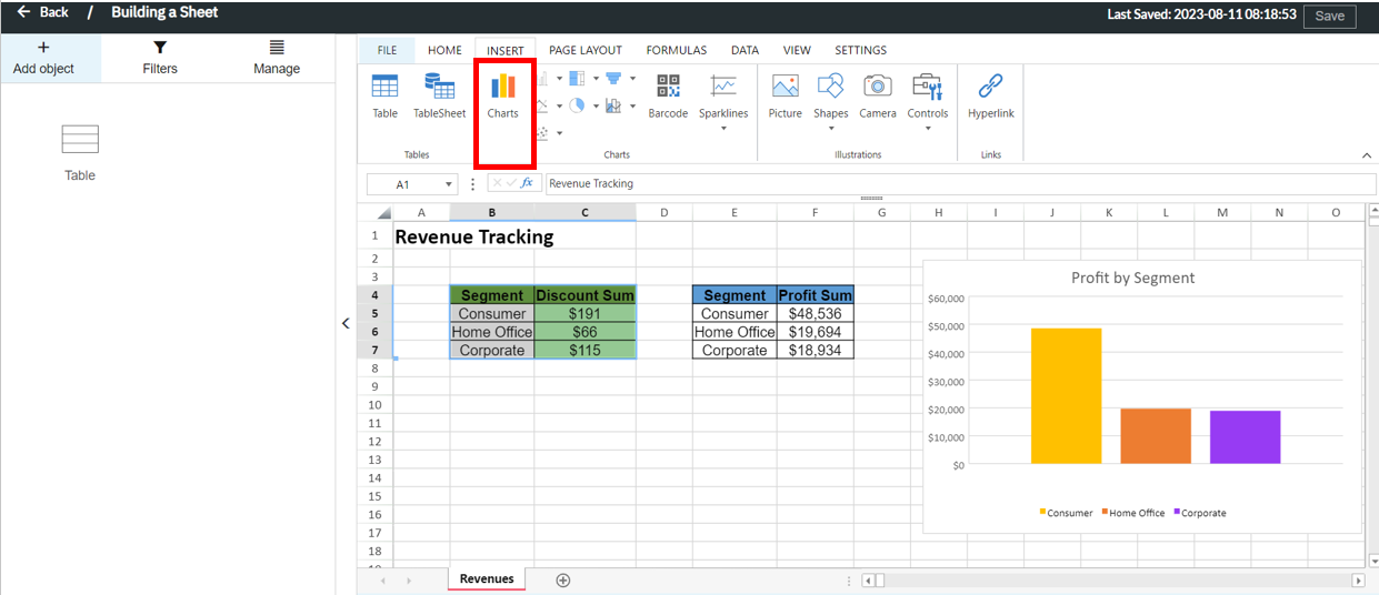
Configuring a Chart in Sheets
You can create a chart in Sheets using data that you input directly in the sheet or a Redbird table, like the one we configured in the Configuring a Table in Sheets section. The steps to produce a chart are the same steps you would use to create one in Excel which are outlined below.
Step 1: Select the data or table
Step 2: Use the Ribbon to insert a chart
Formatting Charts and Tables
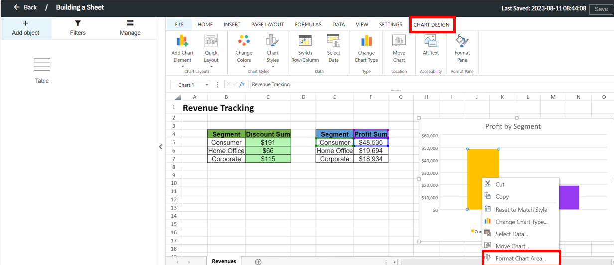
Once you have generated your table and chart objects, you can use the functionality in the Ribbon to make formatting and design changes to create the desired output. The Home section provides a variety of options from font styling to number formatting and fill colors.
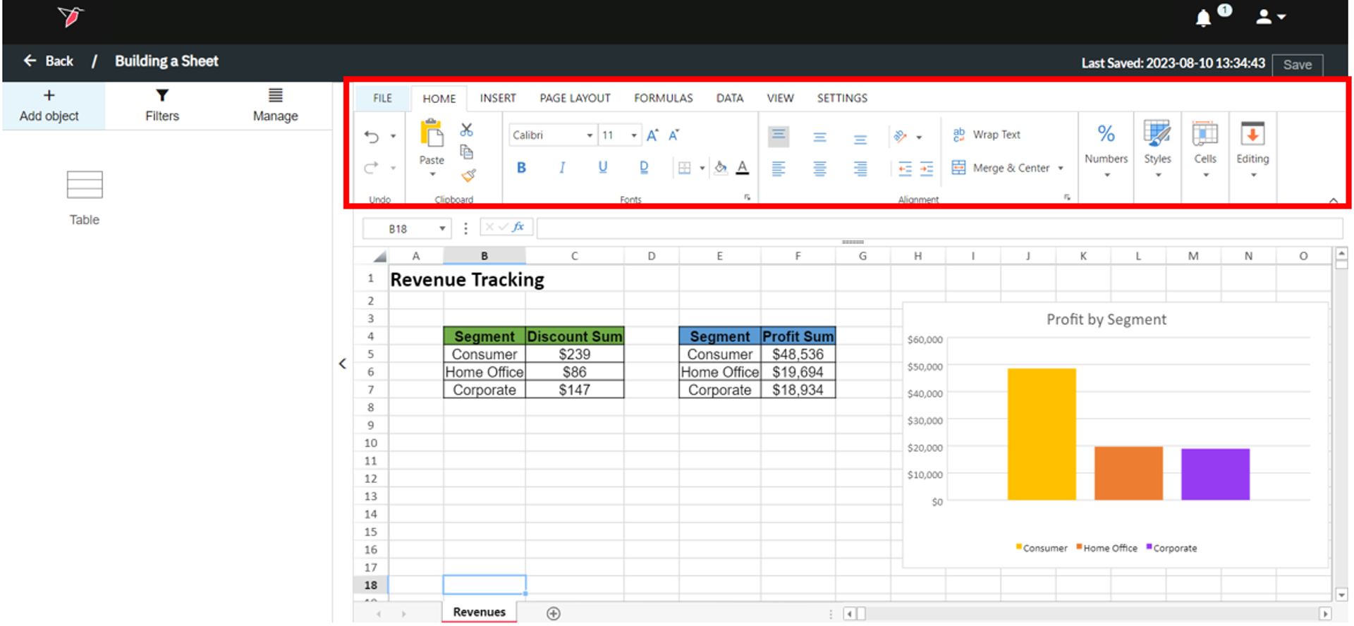
To format the chart you created, select the object in the Workspace and a Chart Design section within the Ribbon will appear. You can also right-click on an object in the chart and select Format Chart Area to make design changes. Use these settings to make the necessary styling adjustments to generate the desired final output.