Building a Dashboard
Background
In this section of the tutorial, we’ll focus on how to visualize your data using a Dashboard Builder node. The dashboarding functionality is extensive, and we’ll walk through a few key object types — including text boxes, charts, and tables — covering how to create and format each one. All visualizations are data-driven and automatically update whenever new data is collected by simply re-running the workflow.
For more information on how to build dashboards, see here.
Creating a New Dashboard
- Open the panel to the left by clicking the plus icon in the top left of your screen. Select Outputs and drag and drop a "Dashboard Builder" node onto the workflow canvas. Connect it to the output dataset produced by the AI DT node: "Financial Data".
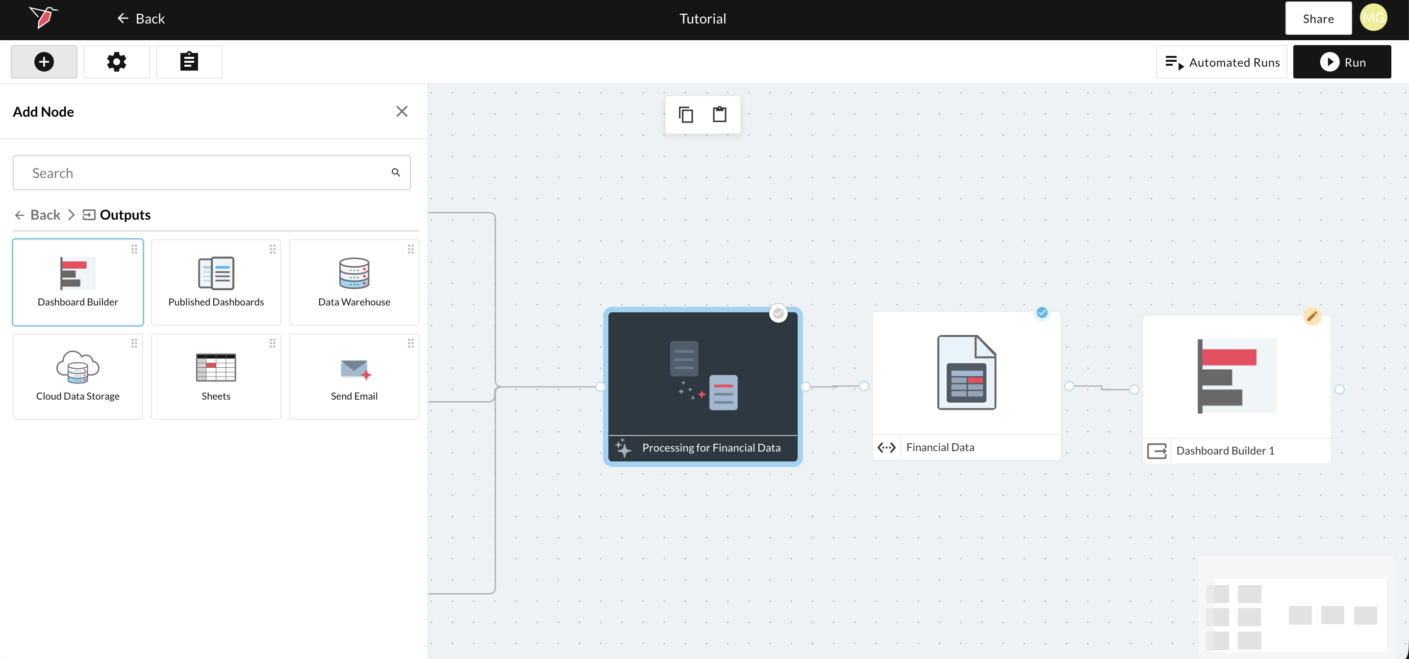
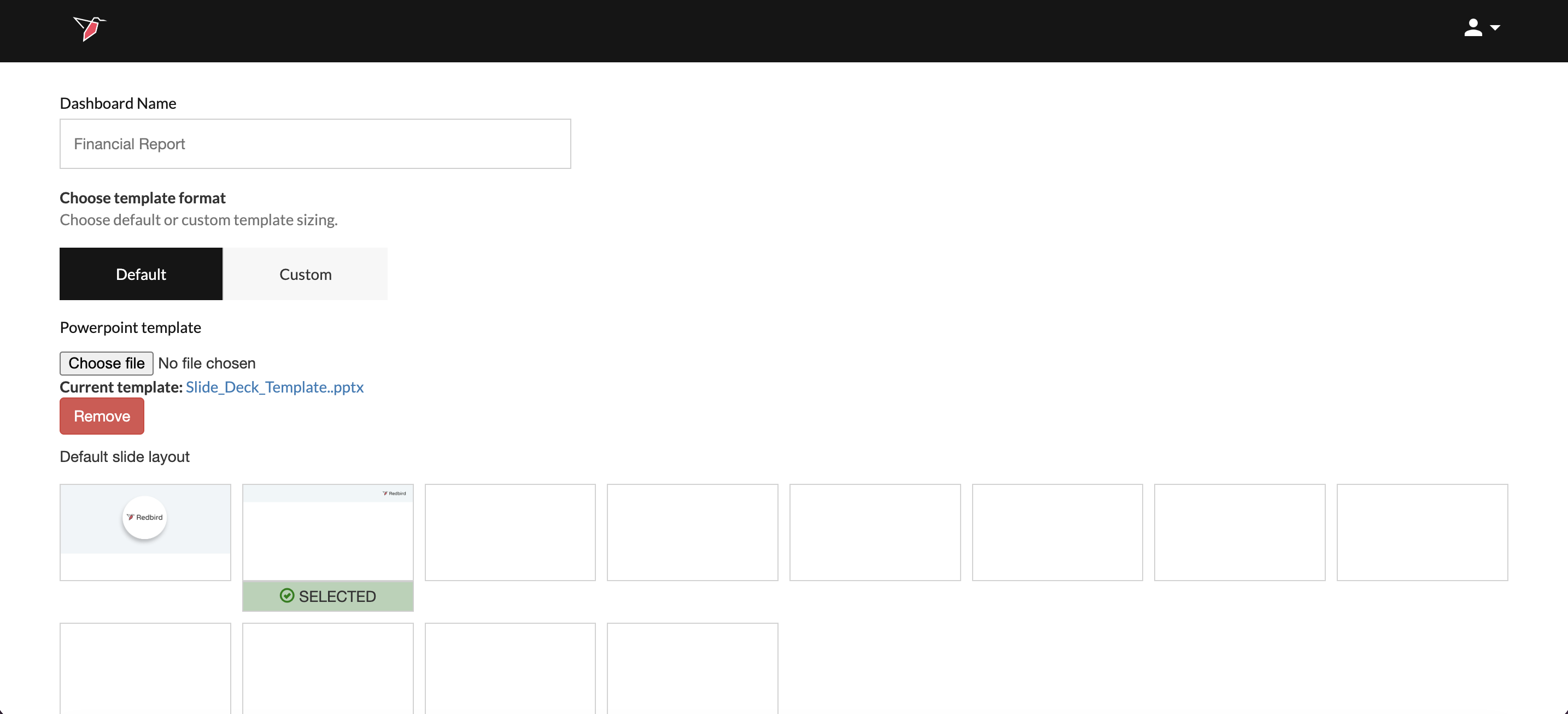
- This will bring you to the dashboard configuration page. Name the dashboard "Financial Report", upload the Template and wait for the thumbnails to generate. Click the second thumbnail with just the header to select it. Then Click Done.
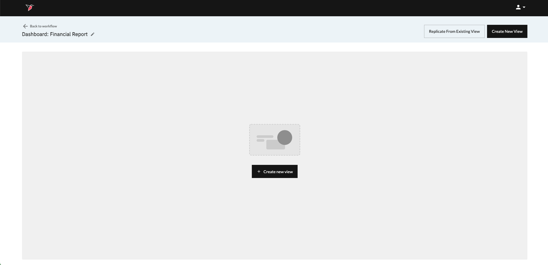
- This will take you to the View page, where you can start adding new views and manage existing ones. Click Create New View either in the center of the page or at the top right to get started.”
Creating a Title View
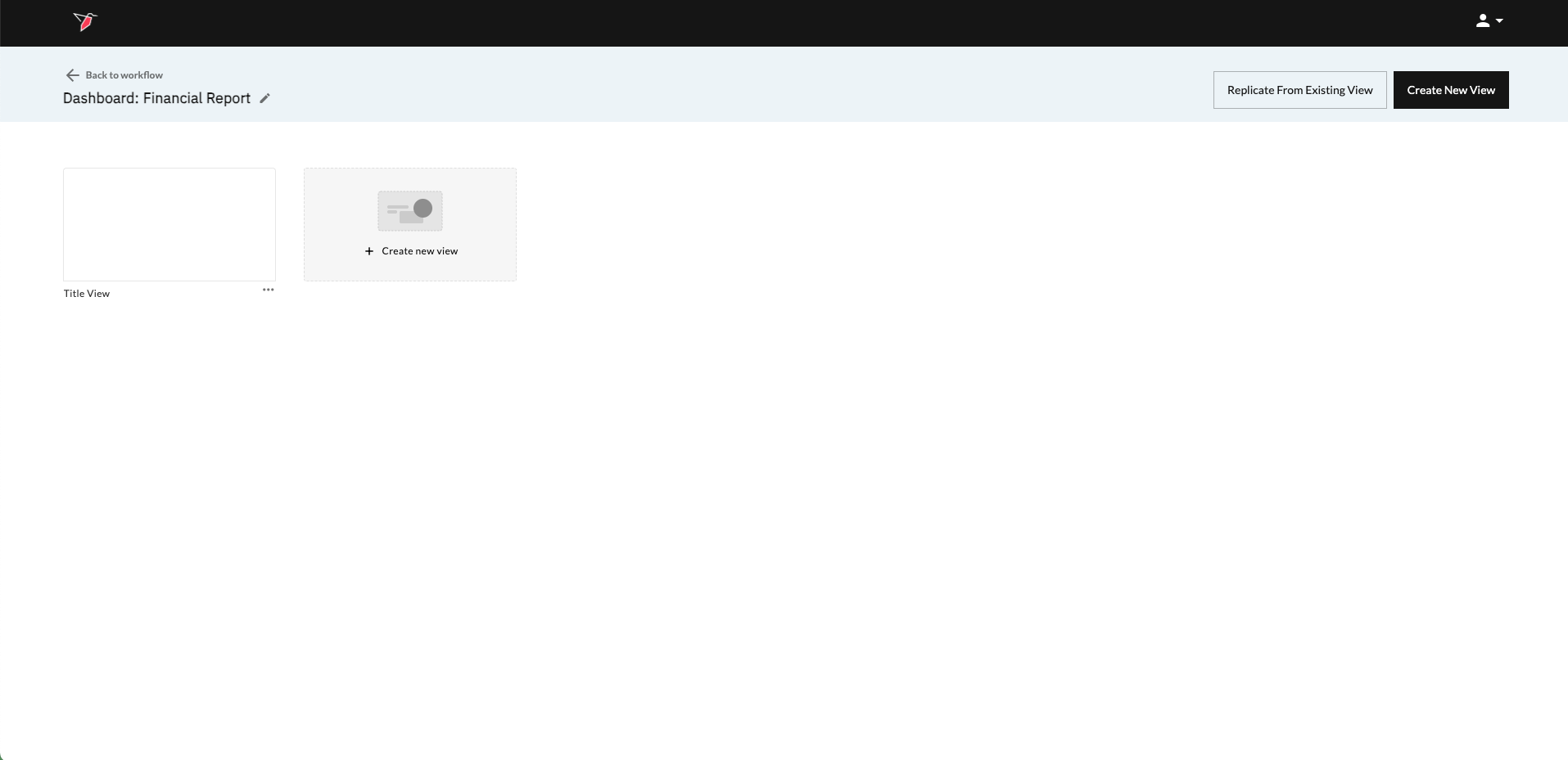
- A new view will appear in the view list. Name it Title View by clicking on View_1 and overwriting it.
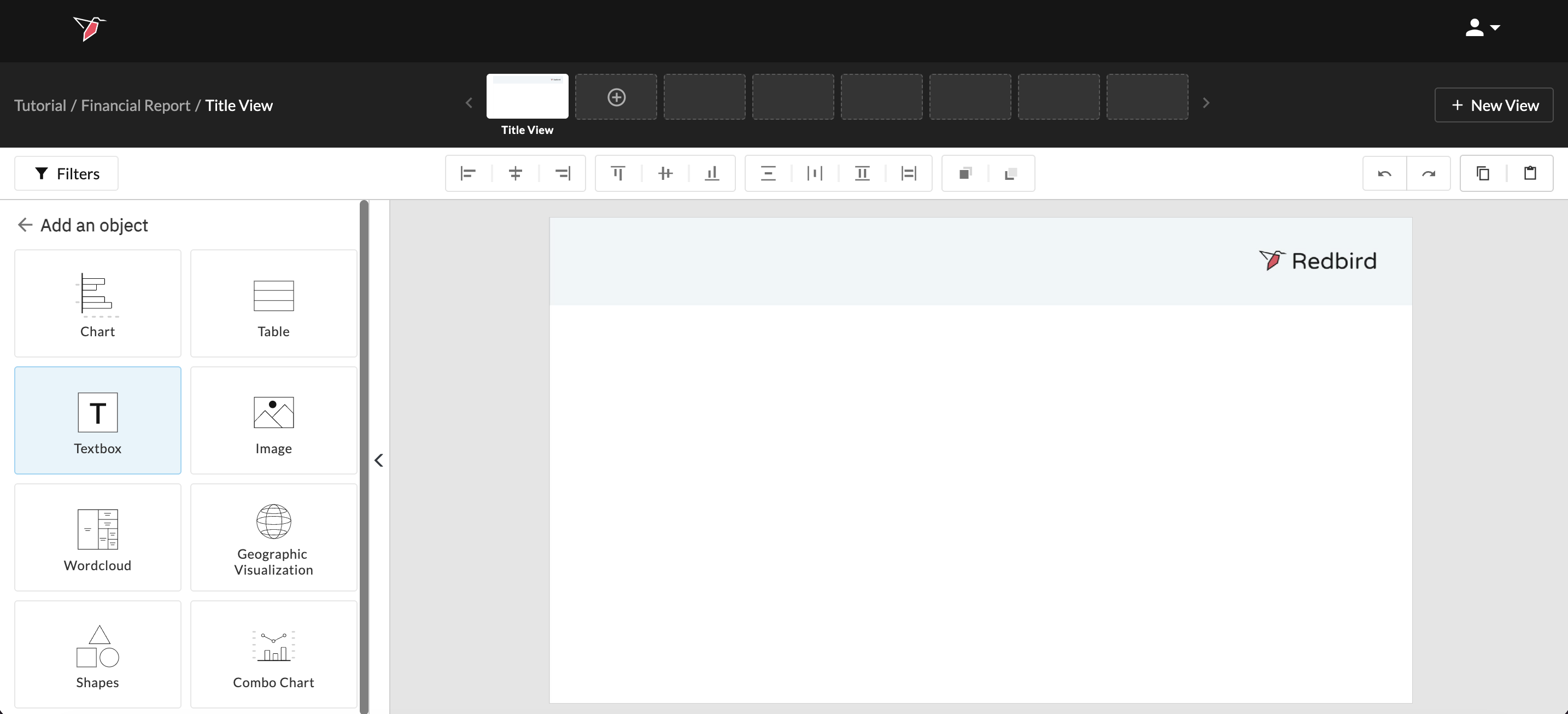
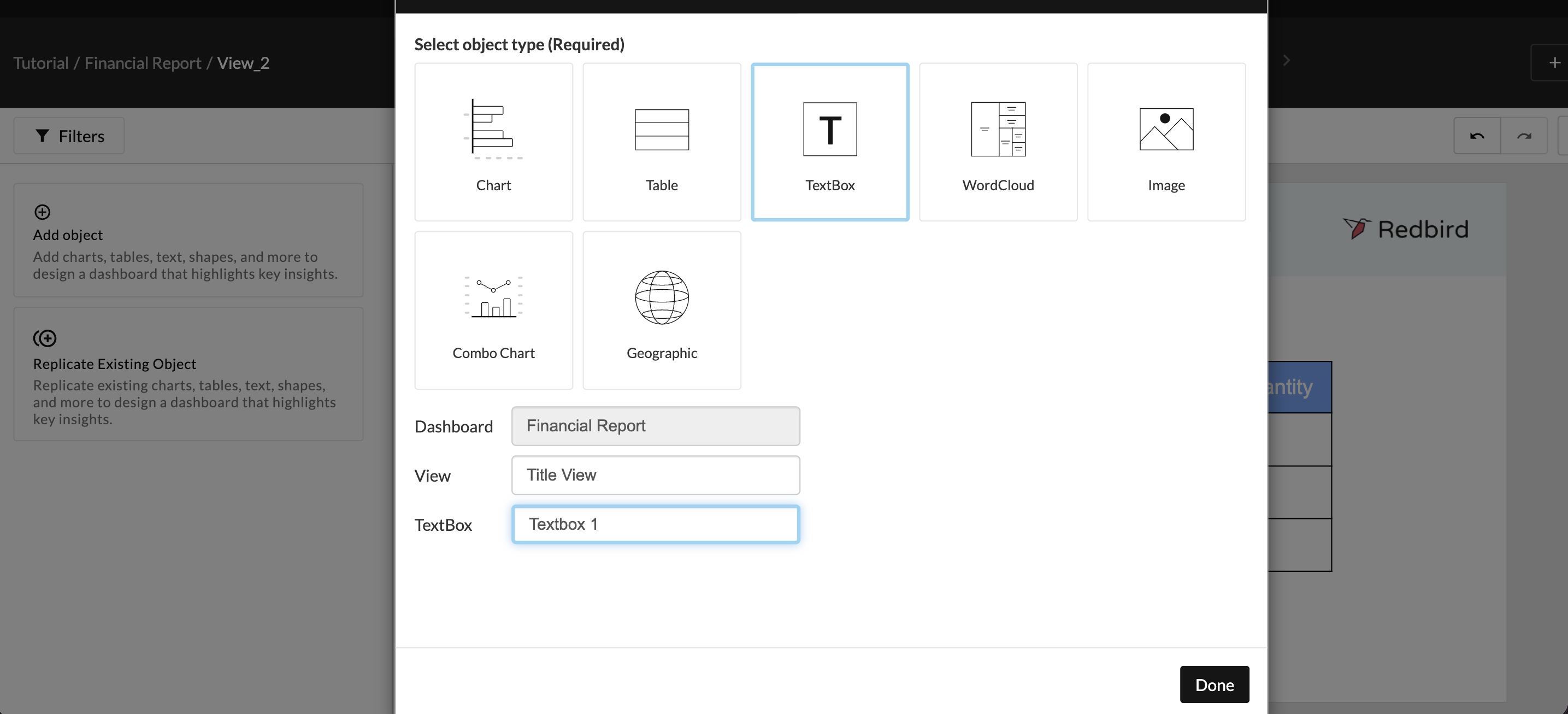
- Click on the view to enter it. Click Add Object from the Action Panel.
- Add a textbox to give the dashboard a title and add relevant information. Click the Textbox icon in the Add object pane.
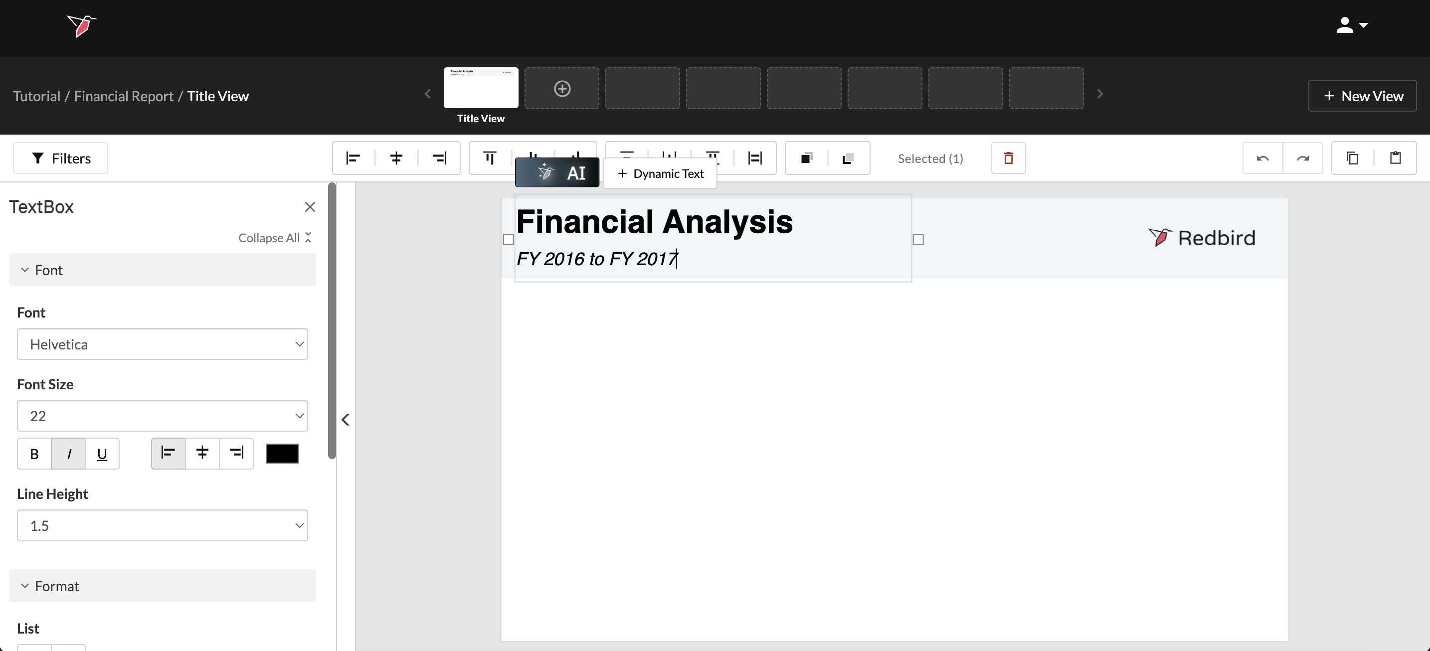
- Populating and formatting the textbox:
- Type Financial Analysis on one line, then hit return and type FY 2016 to FY 2017.
- Change the font to Helvetica and line height to 1.5 using the options in the Action panel on the left.
- Highlight just the first line and change the font size to 39 and apply Bold font style. Then highlight the second line and increase the font size to 22 and apply Italic font style.
- Click and drag the textbox to reposition it so it sits within the blue header section.
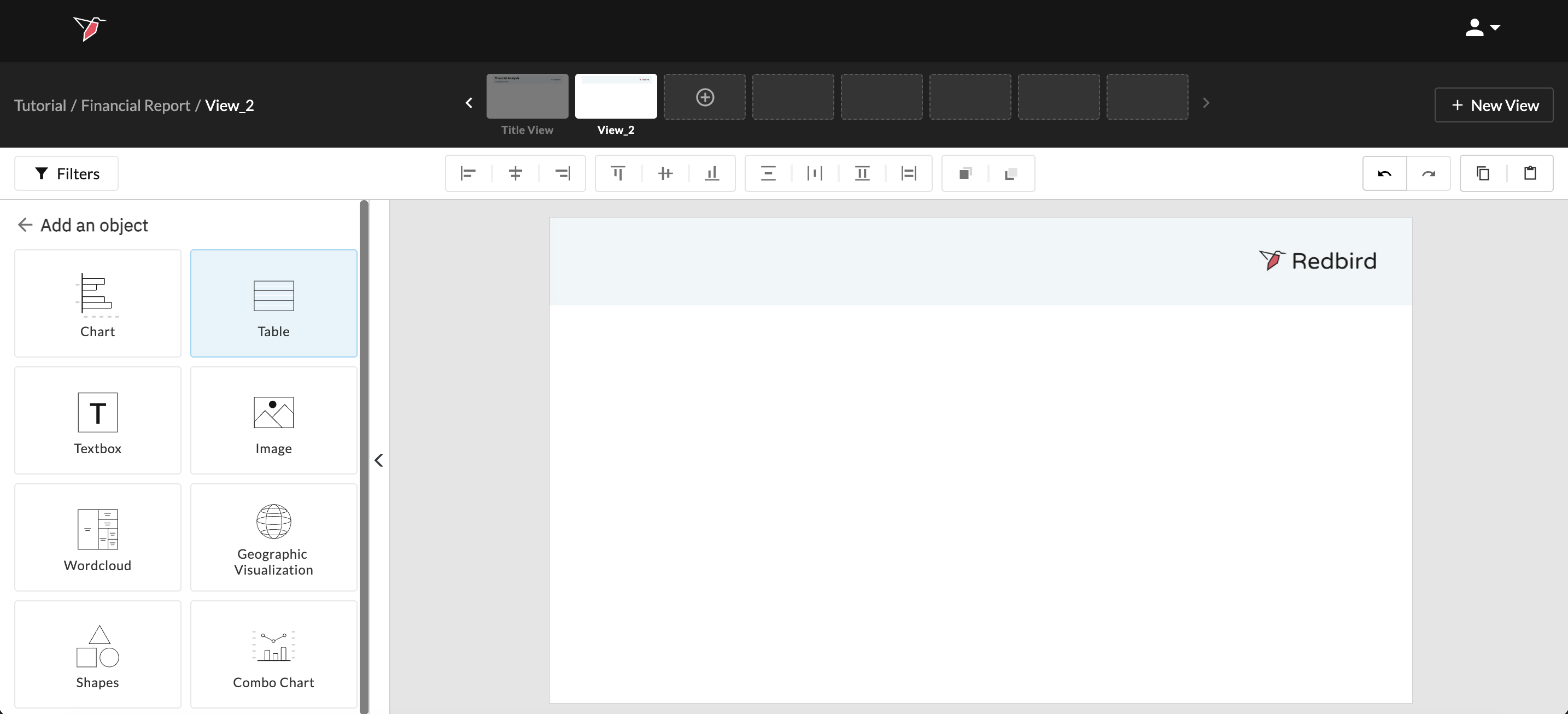
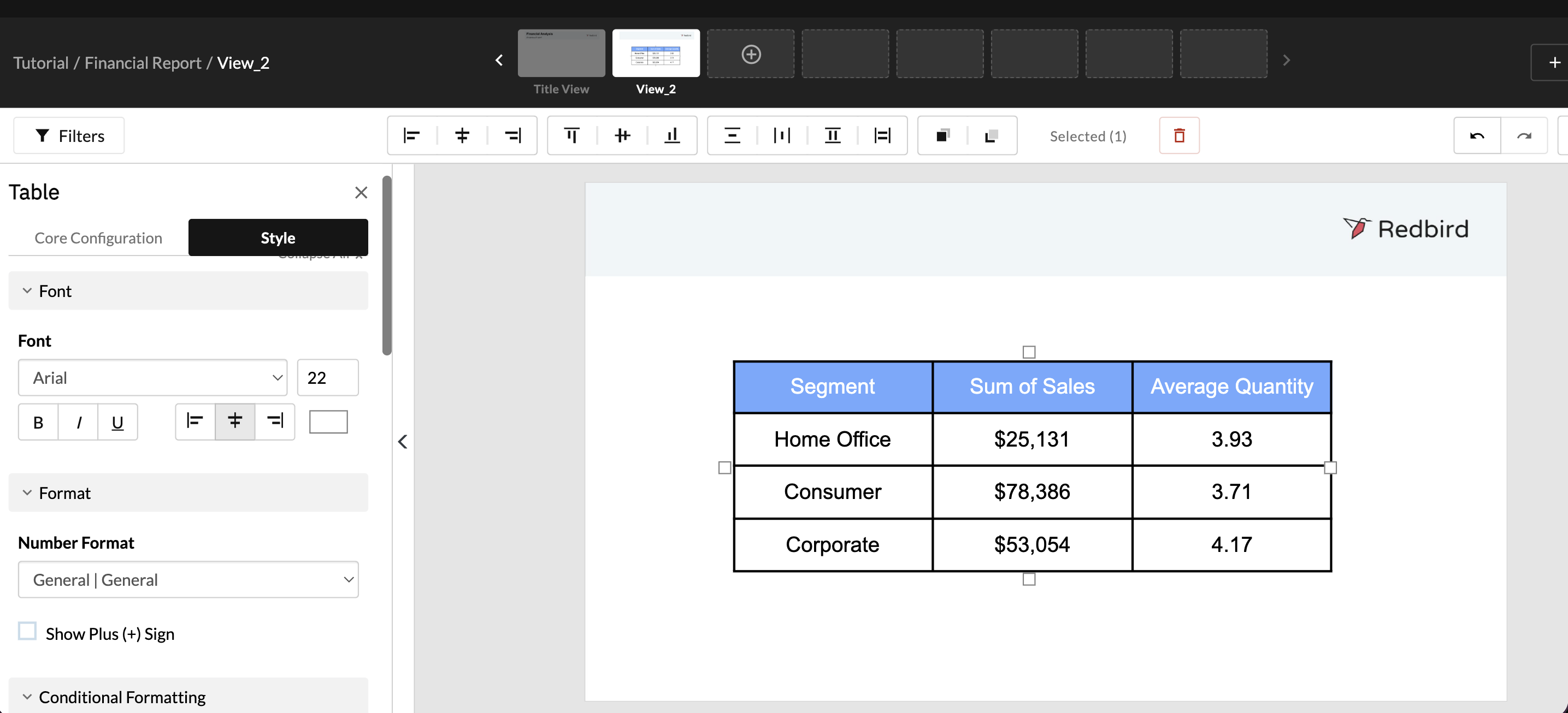
Creating a Table
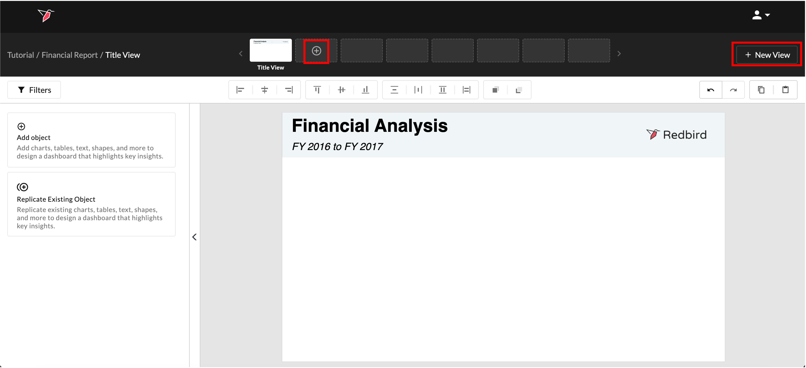
- Click + New View or the + icon on the thumbnail preview section to create a new view.
- Click Add Object then the Table Icon.
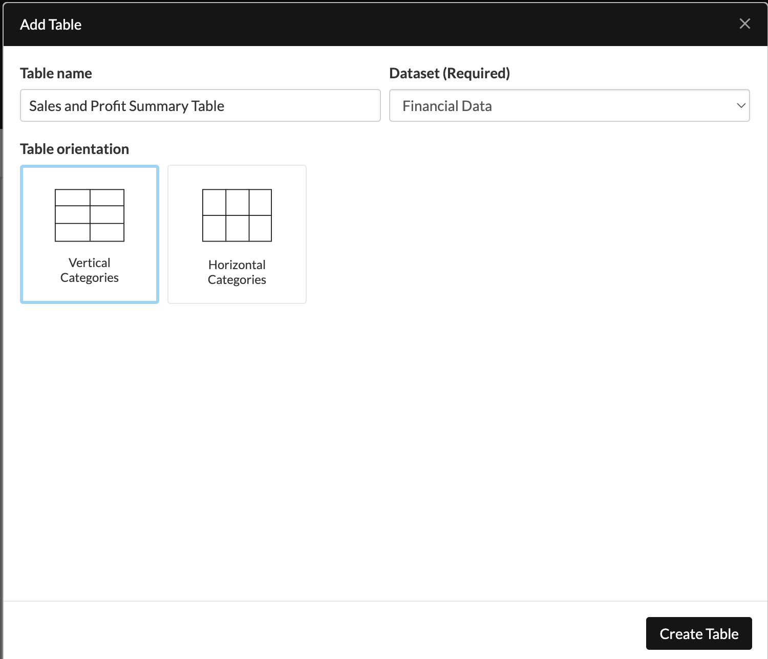
- Name your table "Sales and Profit Summary Table" and select Financial Data as the dataset to connect this object to. Click Vertical Categories, then Create Table.
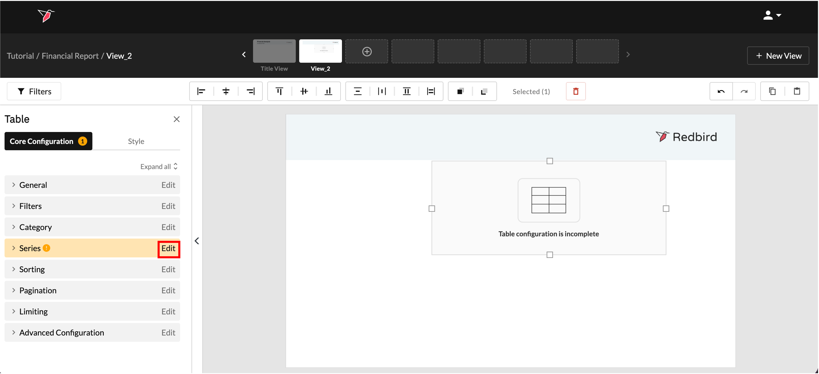
- Click on the table object then click Edit in the Series section of the Action Panel to add a series.
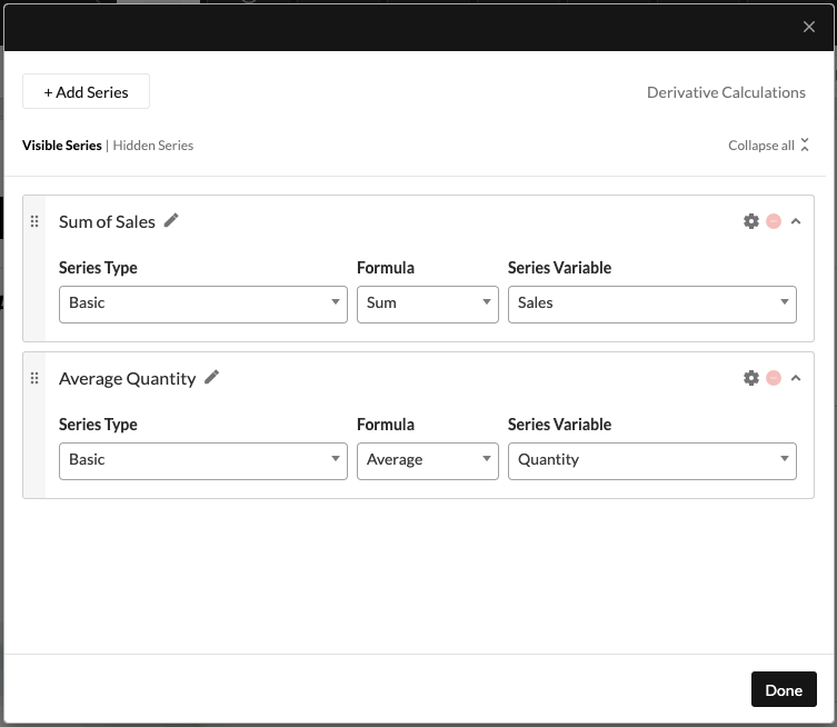
- Click Add Series then name it "Sum of Sales". Select Sum as the Formula and Sales as the Calculation variable. Click Add Series again to add another series showing average number of units sold, select Average as the Formula then Quantity as the Calculation variable. Label the series accordingly then click Done.
- Click Edit on the Category section of the Actions Panel. Choose Segment from the Column Drop-Down. Click Done. These will be the rows in your table.
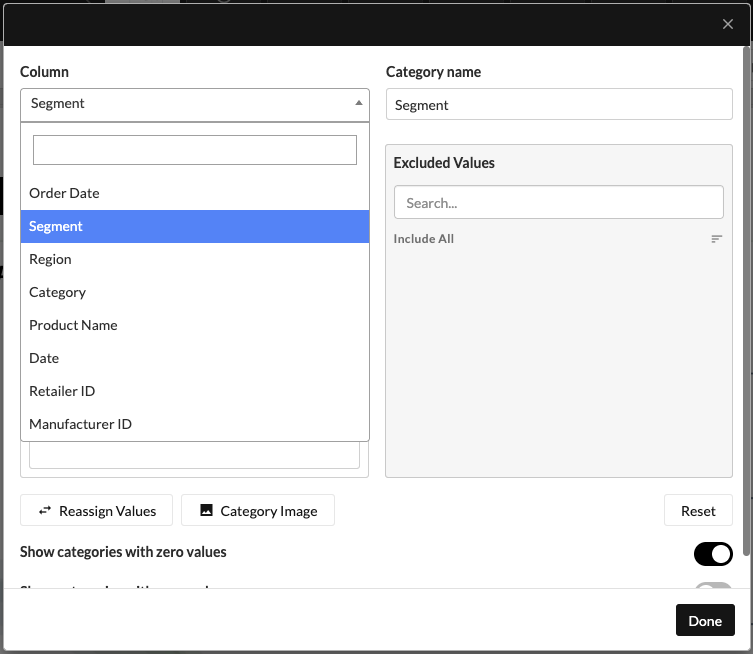
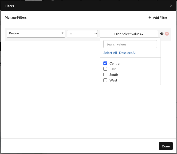
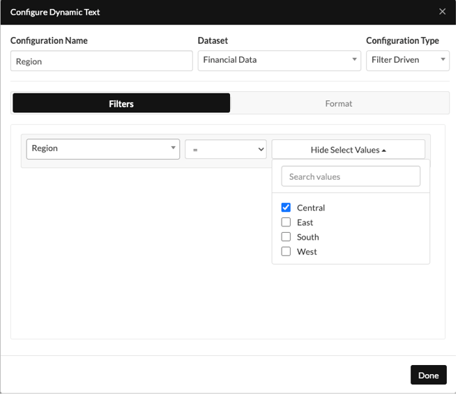
- You can add a filter to make the table dynamic and allow the user to choose which data they wish to see in the table to do so:
- Click Edit on the filter section of the Actions Panel;
- Click Add Filters
- Click Region as the column;
- Select “=” as the operator;
- Select Central as the value;
The eye icon signifies that the filter will be accessible on the dashboard - you would click to toggle this off if you wanted the filter to be fixed for this chart.
- You can format your table to the desired style using options in the Style pane on the left. For example you can:
- Highlight the first row and increase the font size, change the background and font color
- Move the table to the middle of the view
- Drag and enlarge the table using the squares around its edges
- Increase the font size of the body contents of the table
- Select the whole table and apply all borders
- Drag and highlight the sum of sales column and change the number format to currency
-
Lastly, to add a title to your view that updates dynamically based on the filter selected:
- To reuse the formatting or content from the title view, first make sure the table is not selected—click anywhere else on the view or click X in the Actions Panel. Then, click Replicate Existing Object from the Actions Panel.
- Click the TextBox Icon
- Select Title View and Textbox 1 from the drop-downs. Click Done.
- Replace the “Financial Analysis” text with “Key metrics by segment for” and delete the rest of the text.
- Place your cursor at the end of the sentence then click + Dynamic Text at the top of the textbox
- Name your Dynamic Text Configuration "Region". Select the dataset and toggle the Configuration Type to Filter Driven.
- Apply the same filter set up as you did for the table then click Done.
- Select Filters above the Actions Panel, change the filter value from "Central" to "East" and click Update. The data and the headline will update automatically.
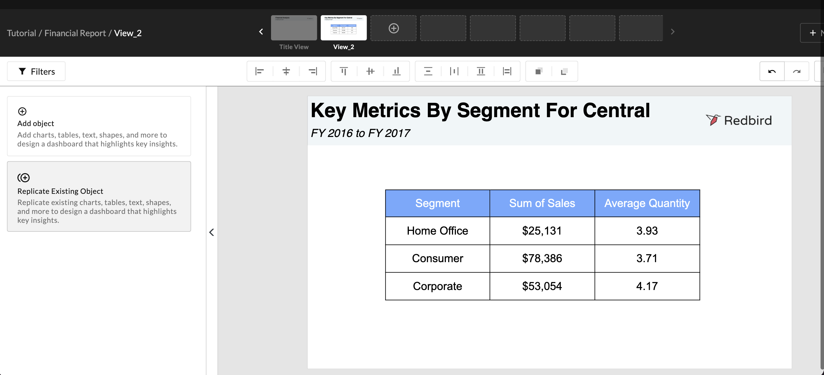
Original State
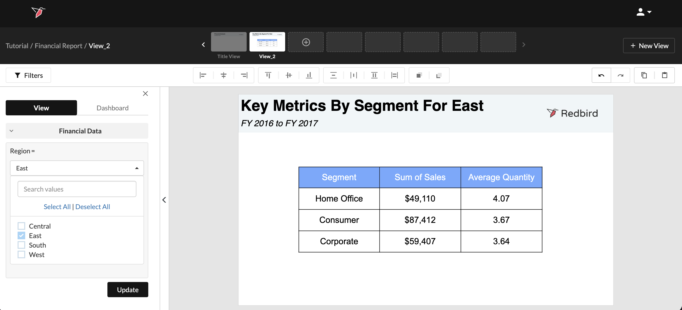
Updated State
Building a Chart
For this tutorial we will be building out a line chart to show trended sales for each region in the company.
-
Create a new view. Click Add Object, then Chart.
-
Name your Chart "Sales by Region and Segment", then select Financial Data from the Dataset drop-down.
-
Select the 100 Stacked Column Icon and click Create chart.
-
Click on the chart object to select it then click Edit in the Series section of the Action Panel to add a series.
-
Leave the Series Type as "Basic" and select Sum as the formula.
-
For Series Variable select the Sales column. To have the series split by Region, toggle on Series split and choose Region as the Split Variable. Click Done.
-
Click Edit on the Category section of the Actions Panel. Choose Segment from the Column Drop-Down - these values will appear across the X axis. Click Done.
-
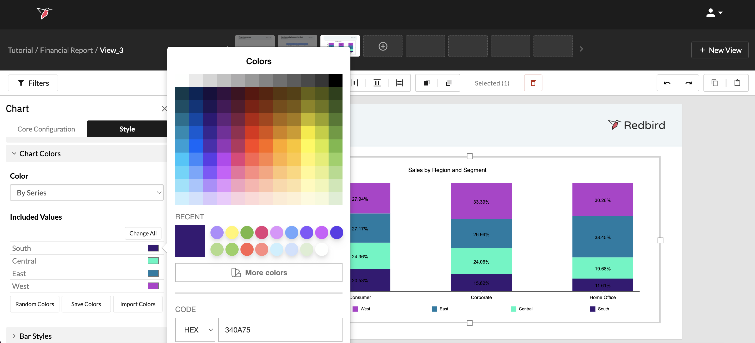
Click the Style tab in the Action Panel, then click Chart Colors.
-
By default one color will be applied to all values, select a specific color for each region by:
- Clicking the colored square on each row of the Included values and then choose a color from the color picker, or
- Clicking Random Colors
- Drag the edges to increase the size of the chart to fill the view
- To apply further formatting, within the Style section of the Actions panel you can:
- Show the Title and format it
- Add a legend by toggling on the legend section then choosing the position and font settings.
- Add data labels to have details of each data point
- For the vertical Axis, select Percentage | 0%, and adjust the font size if required
In this tutorial, we walked you through just a few of the many visualizations Redbird offers to bring your data to life. In the Outputs section of our knowledge base, you can learn more about all the elements of the Dashboard Builder tool.
🎉 Congratulations! You’ve completed the tutorial. Feel free to explore the rest of our documentation for more in-depth information whenever you need it.